When decorating an interior, one key principle can completely transform our approach: complementary colorsThis color concept is as interesting as it is inspiring and opens up a world of creative possibilities for our interiors. In our House, these color associations bring spaces to life and reflect our personalities with authenticity. Through this practical guide, we will examine this captivating visual phenomenon together, from its definition to its practical application in different fields. Whether you are looking to harmonize your living room with contrasting touches or to create balanced atmospheres, opposite colors on the color wheel hold the key to an aesthetic that is both natural and refined.
Our article in brief:
Understanding the complementary colors, is knowing how to radically transform your decorative and visual projects in a harmonious way. Here's what you need to know.
- THE complementary colors are pairs of opposite hues on the color wheel that aim to create a vibrant contrast and energetic.
- THE color wheel serves as a fundamental tool to identify these perfect associations between warm and cool colors.
- Complementary color duos like red-green Or yellow-purple instantly transform the mood of a space, reflecting your personality.
- These associations mutually intensify the colors, creating a visual harmony naturally balanced and authentic.
In this article
What are complementary colors and why do they transform our interiors?
THE complementary colors represent two directly opposite hues on the color wheel. This diametrically opposed position creates a unique relationship where each pair always associates a warm color with a cool color. When placed side by side, these hues generate a particularly vibrant and energetic simultaneous contrast, each intensifying the visual perception of the other.
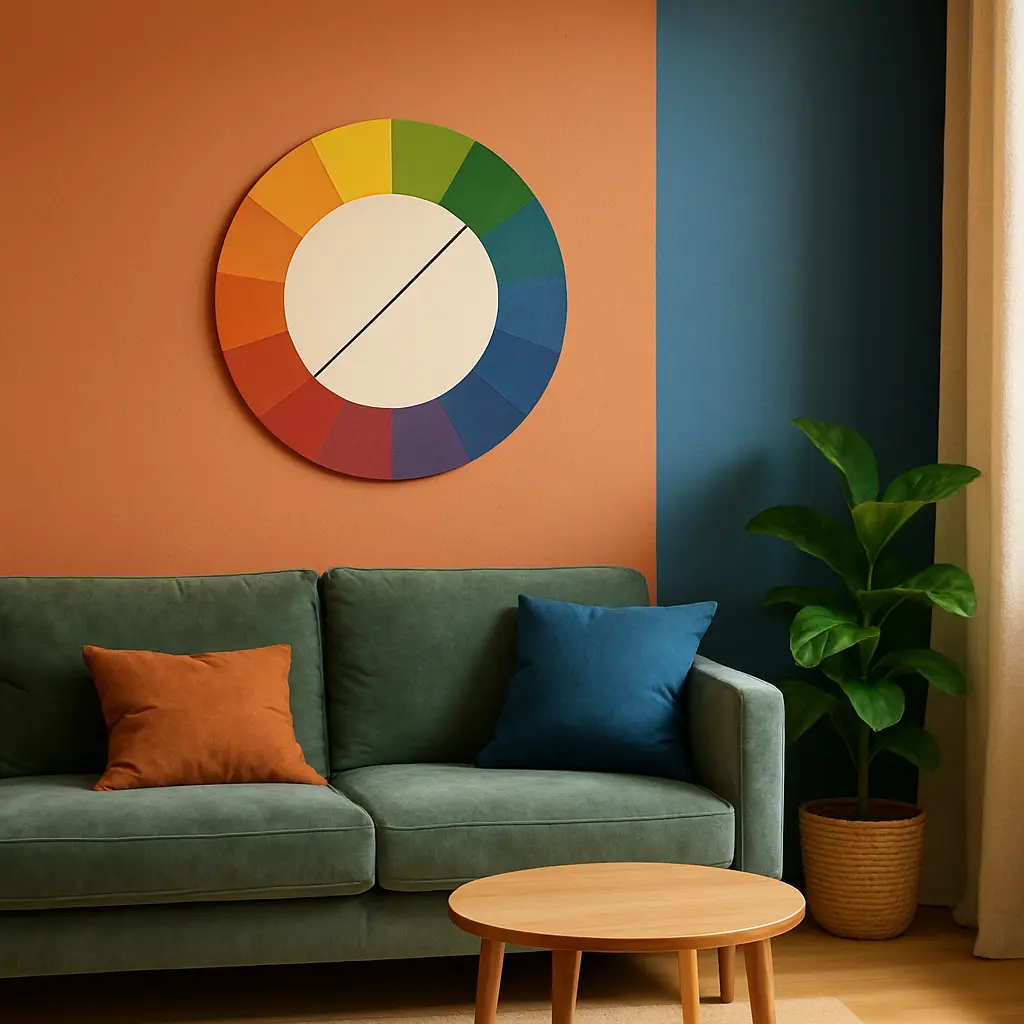
This chromatic phenomenon has enchanted artists and designers for centuries, using it to create captivating works. In our interiors, these combinations bring balance and dynamism, transforming even the most neutral spaces into warm and personalized havens. The magic of complementary colors lies in their ability to enhance each other while creating perfect visual harmony.
Understanding this fundamental principle allows you to play with contrasts and harmonies to communicate precise emotions and create authentic atmospheres that reflect our personality.
The Color Wheel: How to Identify Perfect Color Combinations?
THE The color wheel is the essential tool for understanding and exploring the relationships between colors.To easily identify complements, simply draw a straight line through the center of the circle – the hues at the ends of this line form a perfect pair.
There are three main color wheel designs, each suited to different creative contexts:
- The RGB additive model (Red, Green, Blue) used mainly in the digital world
- THE CMYK subtractive model (Cyan, Magenta, Yellow, Black) preferred for printing
- THE traditional RYB model (Red, Yellow, Blue) often used in painting and crafts
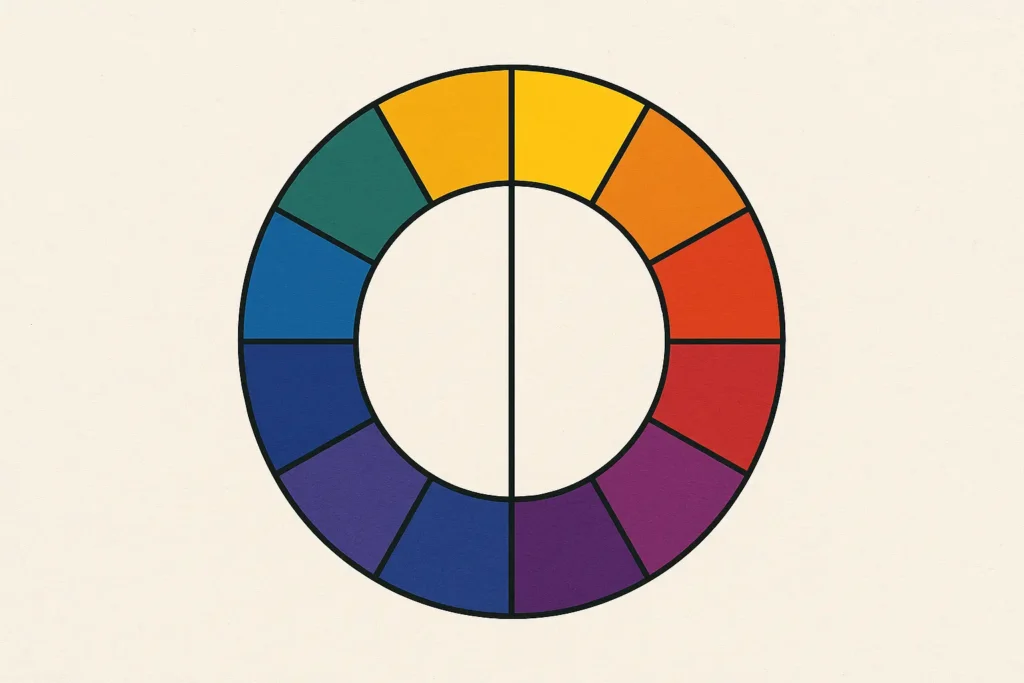
On this circle, we distinguish three categories of shades. The primary colors form the base (red, blue and yellow in the traditional system). The secondary colors are born from the mixture of two primaries, creating violet, green and orange. Finally, the tertiary colors result from the combination of a primary with a secondary, giving life to shades such as turquoise blue or red-orange.
This valuable tool allows us to intuitively analyze harmonious combinations for our decorative and creative projects, transforming our interiors into balanced and authentic spaces.
Complementary color combinations to enhance your interior decor
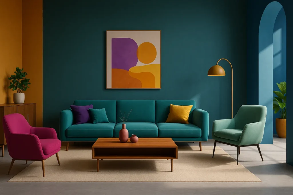
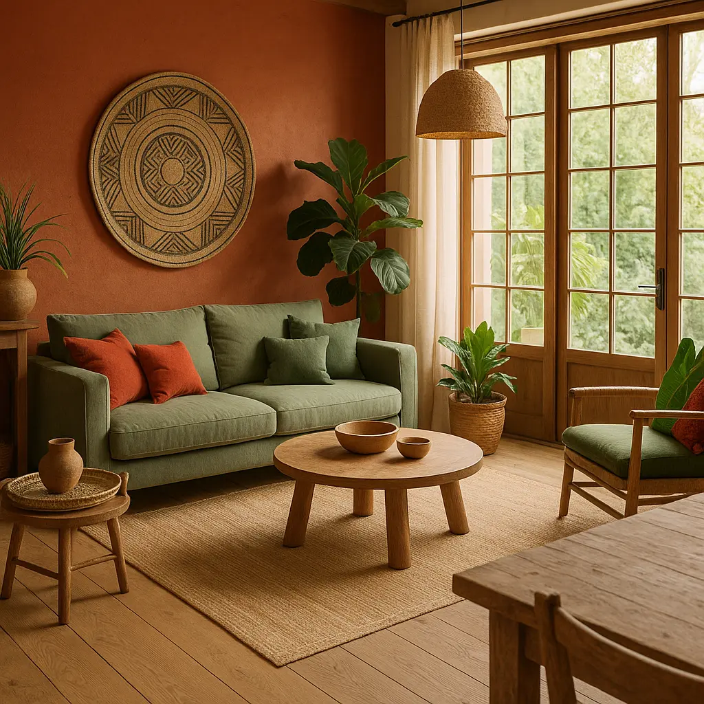
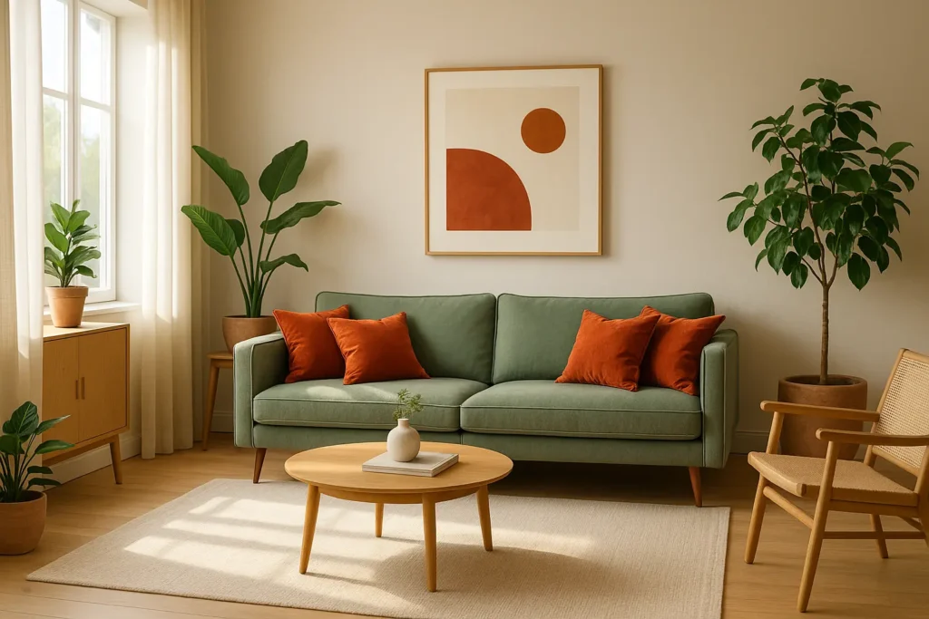
Certain pairs of complementary colors have proven their effectiveness over time. They allow you to create combinations that are both vibrant and harmonious. red and green duo creates a special energy, perfect for energizing a space without overloading it. In a living room, a few brick red cushions on a sage green sofa immediately bring warmth and character.
The association yellow and purple evoke elegance and creativity, ideal for workspaces or children's bedrooms. Touches of deep purple on a straw yellow background create an ambiance that is both stimulating and calming.
| complementary color | Atmosphere created | Ideal application |
|---|---|---|
| Blue and orange | Dynamic and sunny | Kitchen, creative space |
| Bordeaux and duck green | Sophisticated and natural | Living room, bedroom |
| Fuchsia and light green | Energetic and fresh | Office, games room |
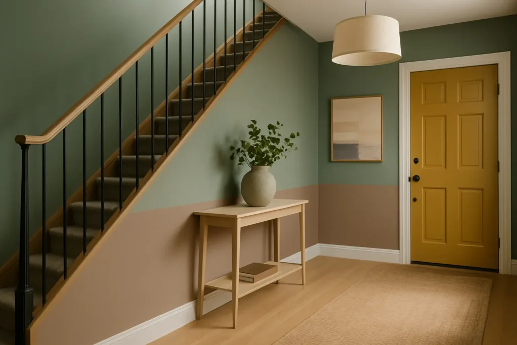
For more subtle interiors, the brown and dark turquoise color duo brings an ethnic chic touch evoking travel and authenticity. These color associations can be modulated by playing on the intensity and saturation of the hues, creating personalized spaces that truly resemble us.
Practical applications of complementary colors in your daily life
How to enhance your interior design with color contrasts?
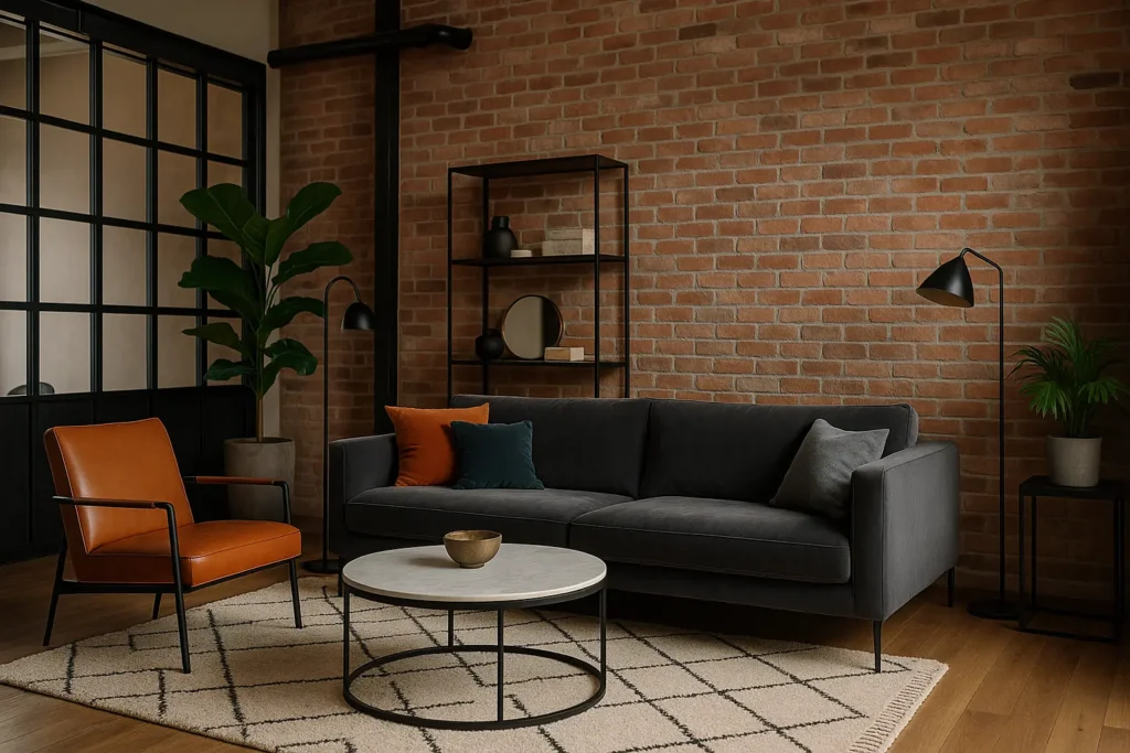
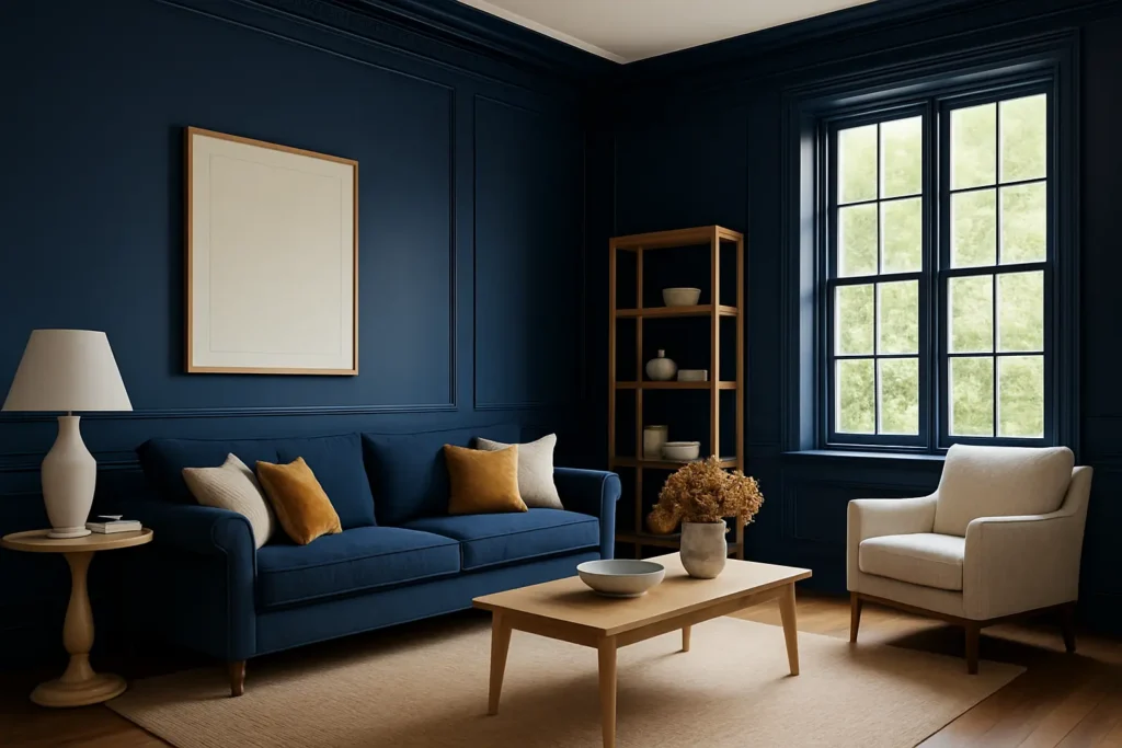
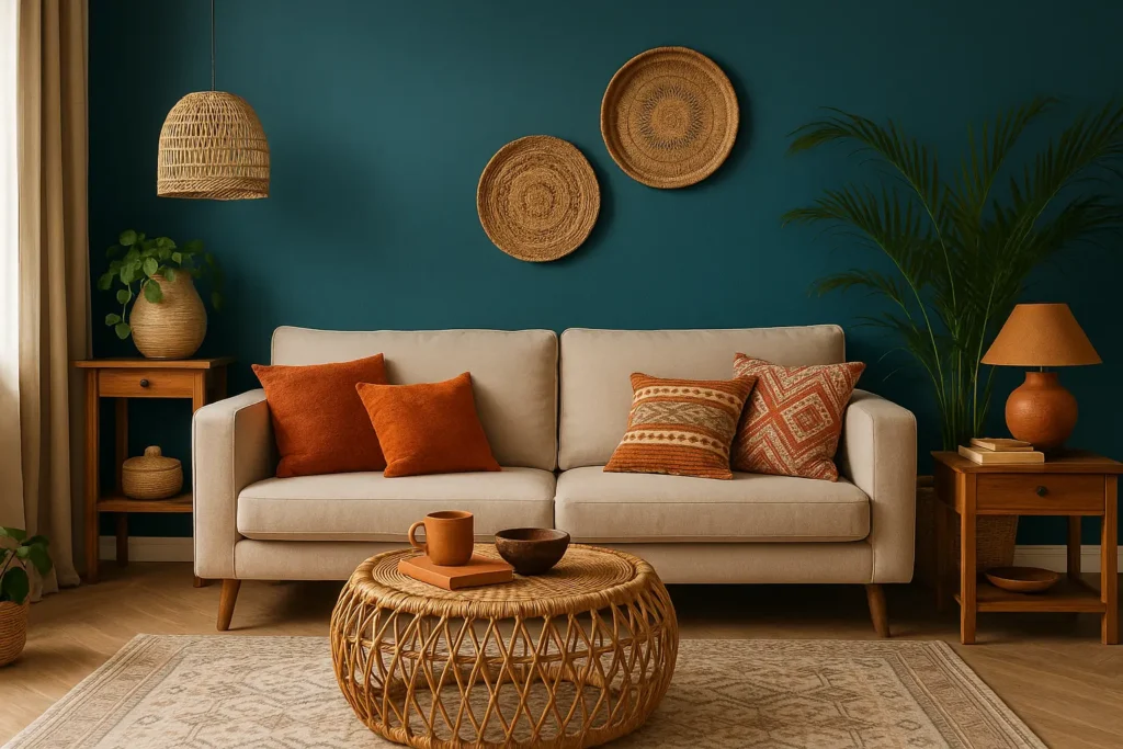
In interior decoration, complementary colors radically transform the mood of a room. For a warm and balanced living room, try a duck egg blue accent wall accompanied by small orange touches in textiles and accessories. This combination creates dynamic harmony without visually overloading the spaceFor softer moods, opt for desaturated versions like sage green with powder pink, creating a soothing cocoon while maintaining chromatic balance.
Art and photography magnified by complementary contrasts
Impressionist masters like Monet revolutionized painting by discovering that shadows were not gray but colored in the object's complementary hue. This chromatic perception transformed modern art, paving the way for a more vibrant and authentic artistic expression.
In photography, capturing an orange sunset against a deep blue sky instantly creates a striking image thanks to the natural contrast of the complements. This technique allows compose balanced and emotionally engaging visuals without artifice.

The visual and psychological effects of color associations
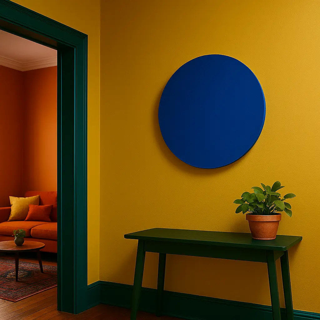
When two complementary colors come together, they produce remarkable visual effects. Each shade appears more intense and luminous near its complementary, creating a captivating visual vibration. This phenomenon, known as simultaneous contrast, explains why these associations naturally attract our attention.
Conversely, mixing two complementary colors produces a neutralizing effect, generating colorful grays or natural browns. This property allows you to tone down an overly bright color by adding a touch of its complementary color—a valuable technique for creating more subtle and natural palettes.
Our perception is also influenced by an intriguing phenomenon: after staring at a bright color for a few moments, our eyes spontaneously see its complement when looking at a white surface. This afterimage attests to how our visual system naturally seeks chromatic balance.
Here's how to summarize these color associations :
- The blue-orange combination evokes warmth and confidence
- The green-red duo stimulates creativity and emotional balance
- The purple-yellow combination inspires wisdom and optimism
Tools and techniques for mastering complementary color harmony
To confidently study the world of complementary colors, several practical tools are available to us. Pantone color chart offers a universal system with more than 3000 numbered shades, allowing you to precisely identify each color and its complement. More accessible, Adobe Color offers a free online palette generator that instantly visualizes complementary associations from a base shade.
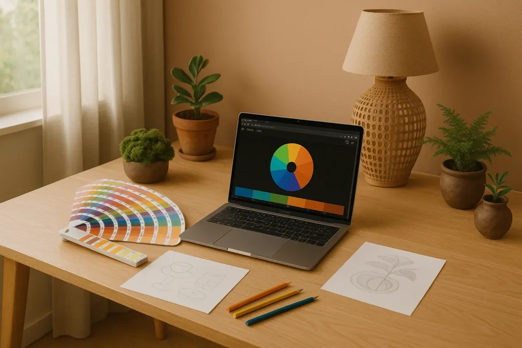
To modulate the intensity of contrasts, several techniques are effective. Desaturation softens a palette by adding gray to pure hues. Playing with proportions—for example, 80% of a dominant color against 20% of its complementary color—creates a more subtle and sophisticated visual balance.
- Use pastel versions of complements for soft moods
- Create gradients between two complements for a harmonious transition
- Combining the rule of complements with other principles such as analogous harmony
Feel free to experiment with these combinations in your creative projects, whether decorating a corner of your home or creating a graphic composition. The natural harmony of complementary colors will bring depth and balance to your creations, reflecting your sensitivity to the chromatic subtleties that surround us.
