Our article in brief
- A white and beige living room it's not about color but about the matter : that's where everything is won or lost.
- Layer several light colors — off-white, ecru, sand, beige, taupe. Two different whites in a room create depth, not clutter.
- There texture replaces color contrast : washed linen, bouclé wool, jute, rattan, ceramic, plaster, stone.
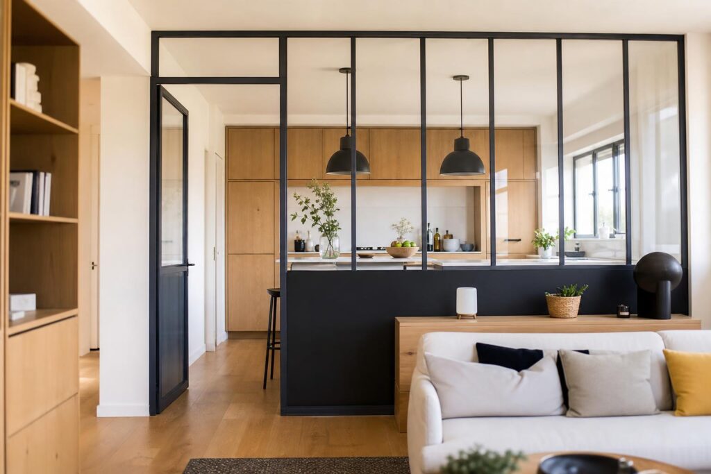
- Just one dark anchor point That's enough — matte black, walnut wood — and an earthy touch or sage green as punctuation.
- There light The decision is made: in the north, beiges turn grey, in the south they turn yellow. We test before painting.
There are two living rooms, one white and one beige. The first is airy, inviting, and you can almost feel the light gliding over the wrinkled linen. The second resembles an airport hotel room: clean, neutral, and utterly boring. The difference between the two almost never lies in the colors chosen—they are often the same.
She is committed to the material. This is the point that most articles on the beige and white decor They leave aside, and yet it's the only thing that truly matters: when you remove color contrast from a piece, you have to replace it with something else. That something is the grain, the weave, the texture, the matte versus the satin. Here's how to build a beige and white living room which has density, with nuances to layer, materials to make interact, the right place to create contrast — and what a light interior really implies on a daily basis.
Why does a monochrome palette of white and beige work, and why does it become dull?
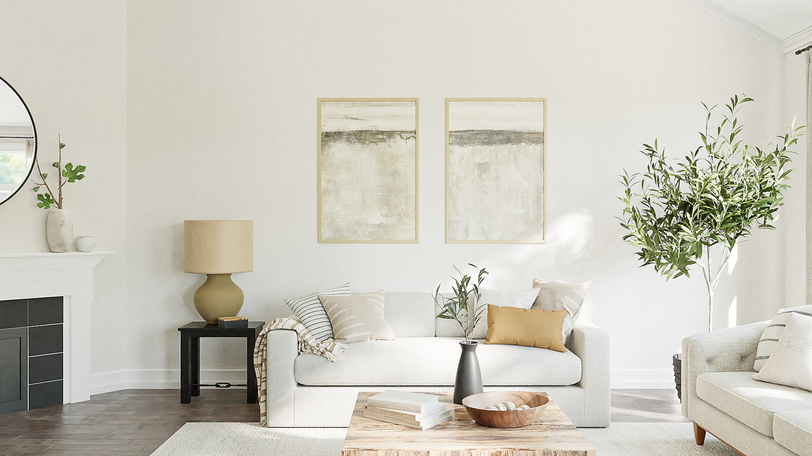
A monochromatic scheme is a single family of hues used in varying intensities. White and beige belong to the same family—warm, light shades, more or less tinged with yellow, pink, or brown. By combining them, you create a room without visual breaks: the eye moves freely instead of stopping at each color change. This is precisely what gives the impression of space and calm, and it's also what makes the combination so timeless, unlike dated palettes that make a room look old after just three years.
One family, multiple intensities: the principle
The mechanism is simple. Where a contrasting palette divides the room into zones, a monochromatic scheme treats it as a single continuous surface, with variations in density. The walls are lighter, the textiles a notch darker, the floors and woodwork even more heavily toned. Harmony is not sought through contrast but through... gradation : from lightest at the top to densest at the bottom, which also corresponds to the way we naturally read a space.
A helpful clarification: we often hear that beige is "soothing." Let's say rather that it's culturally associated with undyed natural materials—raw wool, unbleached linen, hemp, plaster—and that it's this familiarity that is reassuring, more than any measurable effect on the nervous system. I prefer to be honest: we choose a light color palette because it's beautiful and practical, not because a color acts on us like medicine.
Why does a beige living room look bland?
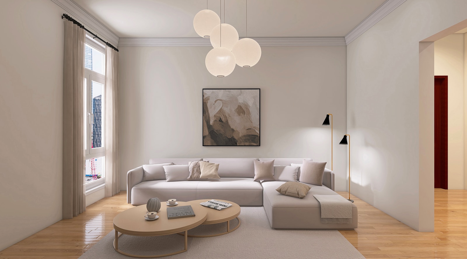
A beige living room When something falls flat, it's never a problem of color. It's a problem of visual information: there's nothing to look at. Three causes consistently recur.
- A single nuance repeated everywhere. Walls, sofa, curtains and rug in the same beige: the tone-on-tone effect collapses into a single shade, and the eye loses focus.
- All smooth materials. A flat fabric, a satin paint, a uniform floor: no surface catches the light, therefore no shadows are formed.
- No downsides. Without a dark element somewhere, the room has no scale — nothing tells the eye what is light, because everything is.
These three causes have the same remedy, and it's not color. We add variation where there isn't any: several light shades rather than one, several textures rather than one, a single dark anchor. If your goal is more about envelopment—low lighting, thick fabrics, the warmth of evening—see our feature on the decor of a cozy and inviting living room deals with this dimension in detail, and a cozy white and beige living room It is very well constructed on the combination of both logics.
Layering whites and beiges: off-white, ecru, sand, greige, taupe
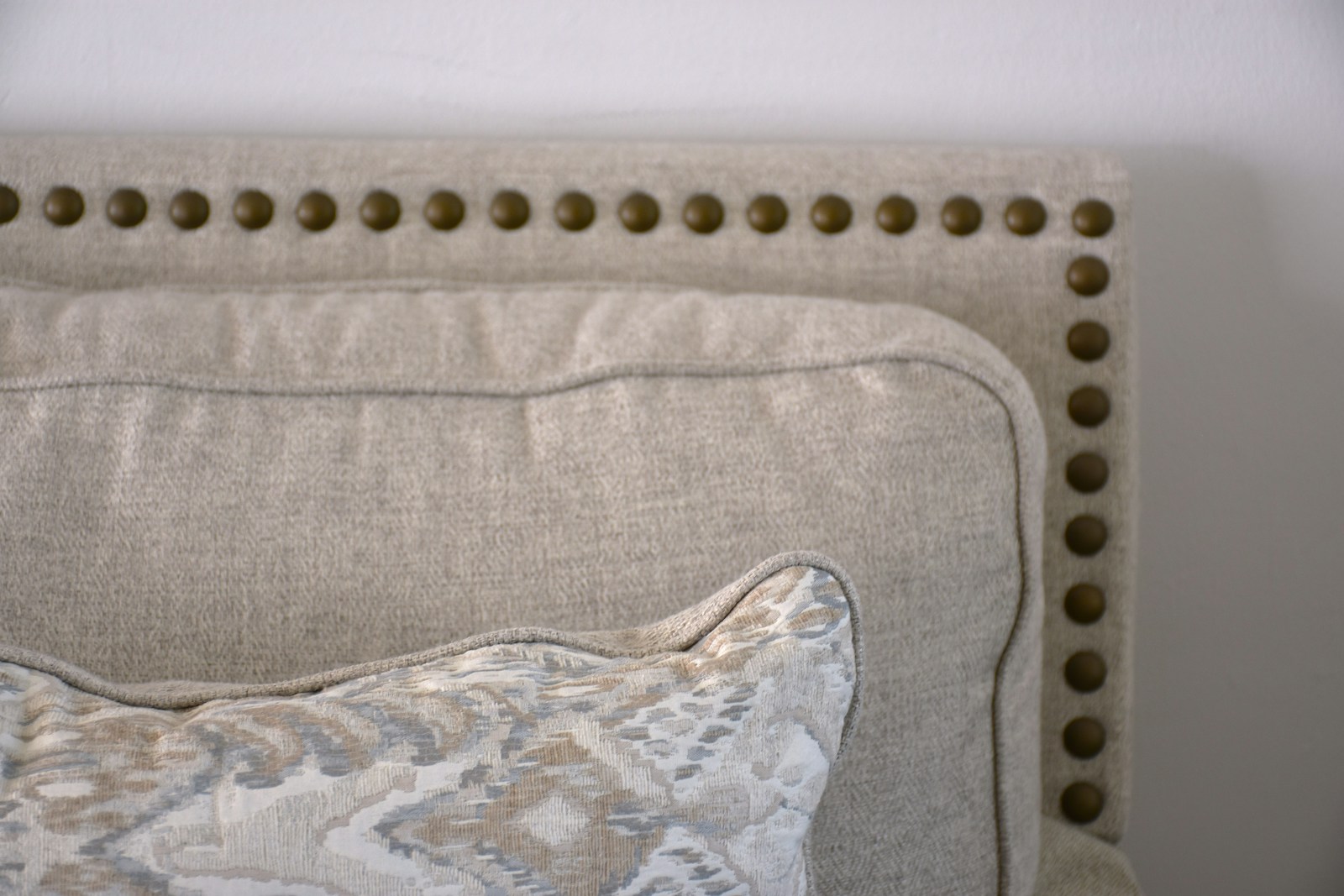
This is the step that almost everyone skips: precisely naming the light colors you're going to use. "White" and "beige" are families, not shades. Within each family, the difference is considerable—between a slightly pinkish white and a greenish white, the room doesn't tell the same story.
Two whites in the same room: depth, not disorder
This is a frightening idea that shouldn't be avoided. Using two different whites in a living room—pure white on the ceiling and off-white on the walls, for example—doesn't create any clutter. It creates a thicknessThe ceiling appears higher because it is lighter than the walls; the walls appear more enveloping because they are slightly more heavily colored. No one will ever say "look, two whites": one will simply perceive a more defined room.
The same logic applies to woodwork, baseboards, and doors. A slightly darker white than the walls, with a satin rather than matte finish, highlights the room's contours without ever being too bold. It's the most discreet—and least expensive—way to add visual interest to a light-colored interior.
In a living room decorated in light shades of gray, it is not the color that makes the room: it is the light that glides over the materials.
The vocabulary of light, from the lightest to the deepest
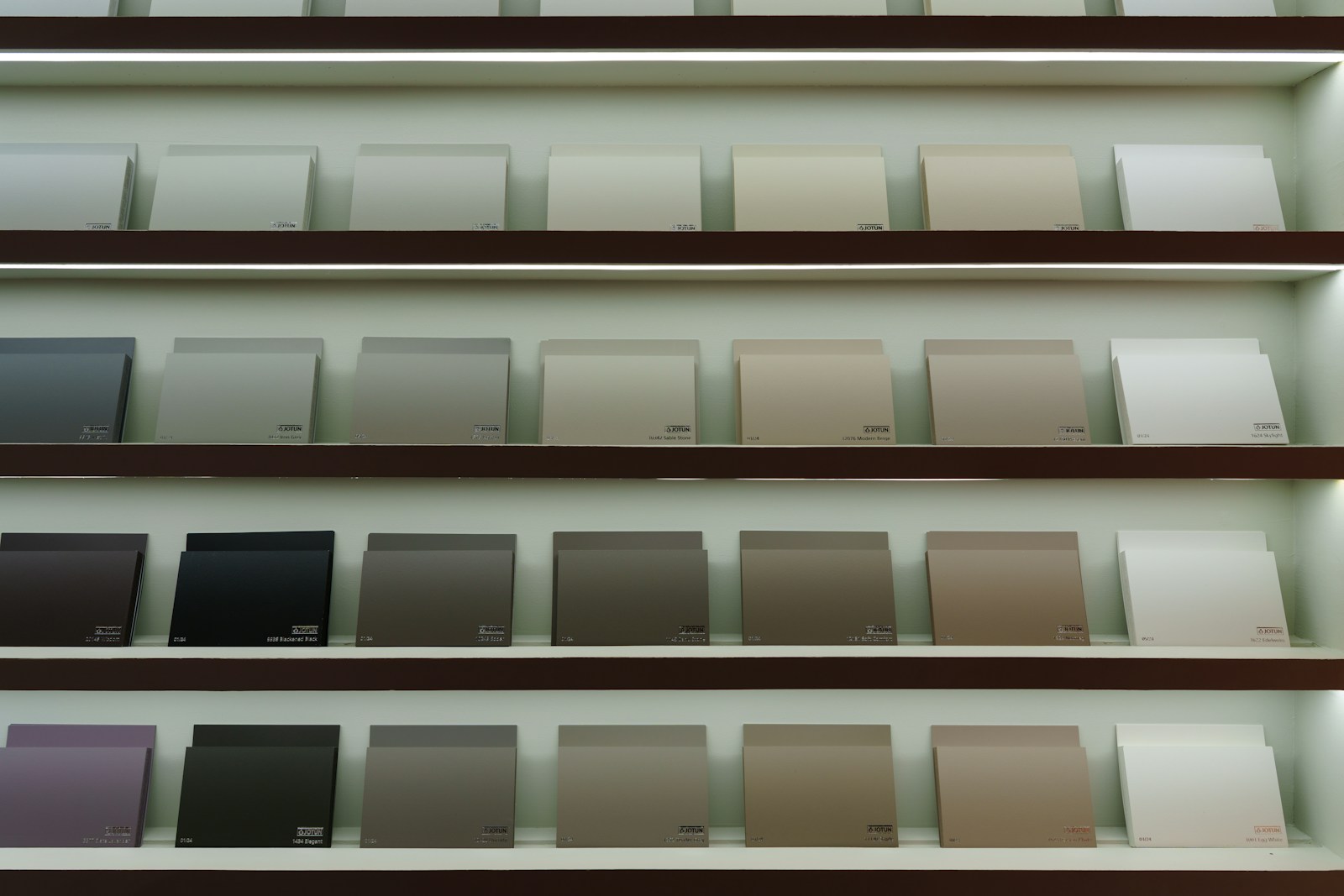
Here are the five nuances that structure 90 % of the beige and white living rooms successful. Pay particular attention to the last column: each shade has its pitfall, and it is almost always related to the light in the room.
| Shade | What we see there | Where to put it | His trap |
|---|---|---|---|
| Off-white | A white softened with a touch of yellow or grey | Walls, ceilings, woodwork, large surfaces | May turn dirty yellow under warm artificial light |
| Ecru | The color of an undyed fiber, slightly beige | Curtains, slipcovers, tablecloths, washed linen | It blends in with the wall if it is placed directly in front of it. |
| Sand | A luminous beige, frankly warm | Rugs, poufs, ceramics, accent walls | Turns golden under the southern sun |
| Greige | Halfway between grey and beige, a pivotal shade | Sofa, armchairs, large textiles | Becomes cold and lifeless in a room to the north |
| Mole | A deep brownish-grey, almost a dark colour. | Punctuation marks: cushions, frames, a section of wall | It quickly becomes heavy if it covers more than a quarter of the room. |
The rule I apply for proportions is this: a very light shade dominates, a medium shade occupies the larger seating areas and textiles, and a deep shade appears only in small touches. Three levels are sufficient—beyond five shades in the same living room, the monochromatic scheme loses its clarity and becomes a visual mess.
Texture, which replaces color contrast
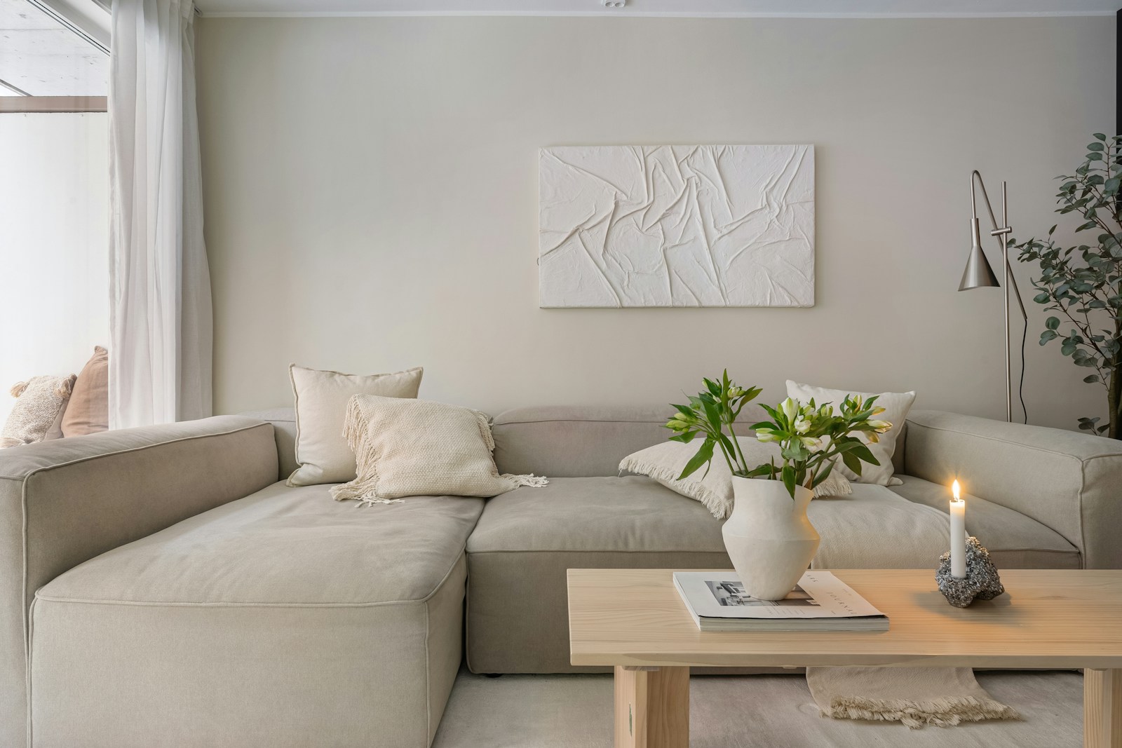
This is the crux of the matter. In a colorful room, contrast comes from the hues themselves. In a light monochromatic scheme, it can only come from elsewhere: from the way each surface reflects or absorbs light. The same shade of beige looks completely different depending on whether it's woven in linen, knitted in bouclé wool, braided in jute, or smoothed in glazed ceramic. This is precisely the kind of contrast we need, and it's infinitely more subtle than a teal wall.
Matte, satin, rough, fluffy: the four registers to be brought into dialogue
Rather than thinking in terms of a list of materials, think in terms of surface registers. A living room has density when all four are present.
- Matte and powdery — plaster, lime plaster, deep matte paint, unglazed terracotta. These surfaces absorb light and give the room a muted base.
- Satin and hard — glazed ceramic, polished stone, glass, unvarnished brass. These are the only bright points in a light monochrome, and two or three are enough to revive the whole.
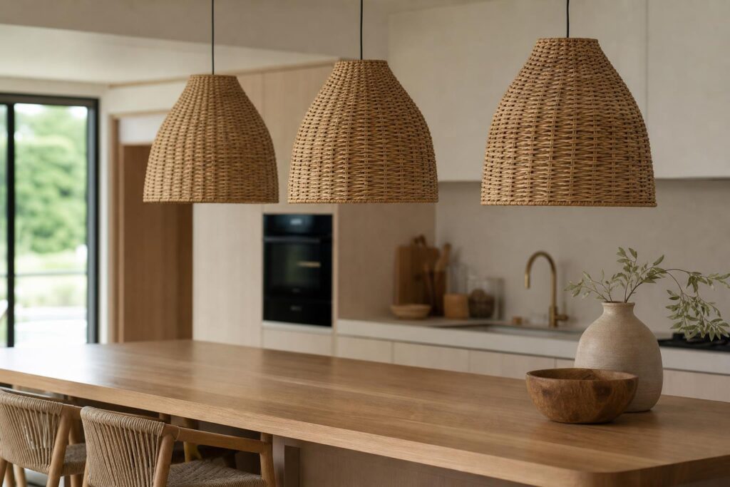
- Rough and braided — jute, sisal, rattan, wicker, hemp, thick linen. It is the texture that creates shade: it creates relief at ground and furniture height.
- Fluffy and soft — bouclé wool, alpaca, corduroy, washed cotton, sheepskin. The tactile register, essential for seating.
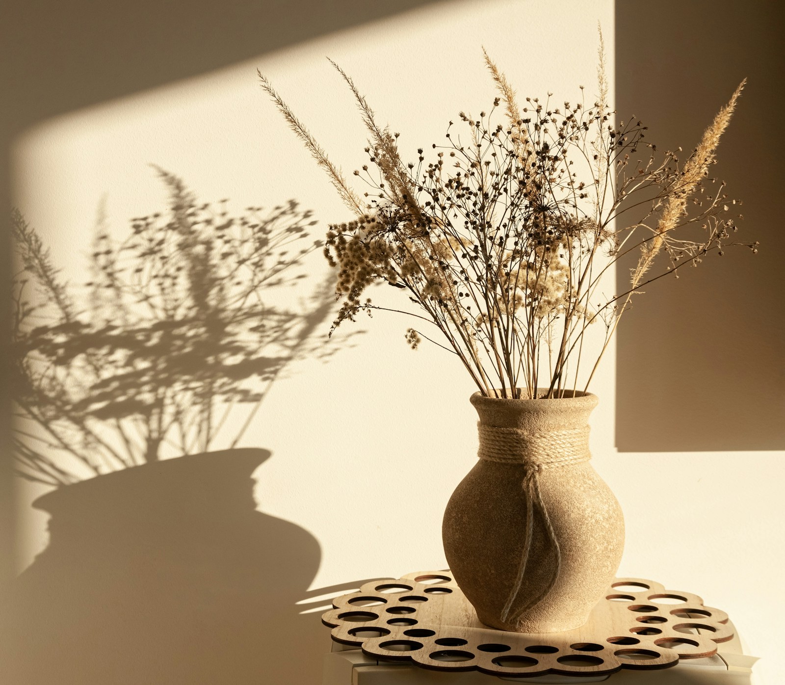
Washed linen deserves special mention because it does almost all the work itself: it creases, thus creating shadows with each fold, and its appearance changes throughout the day. It is also a European fiber—France, Belgium, and the Netherlands account for the majority of global long-fiber production, according to the...Alliance for European Flax-Linen and HempCurly wool, on the other hand, retains its texture over time: the wool fiber behaves like a spring that returns to its natural shape after being twistedThis explains why a looped cushion remains plump where a cotton cushion flattens.
How many materials are needed in a white and beige living room?
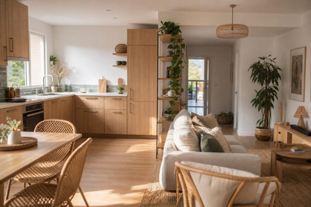
Aim for five to seven distinct materials, no more. Fewer than five and the room lacks depth; more than seven and it becomes cluttered. Here's an example of a distribution that almost always works: a matte wall, light wood flooring, a linen sofa, a jute rug, two bouclé cushions, a travertine or ceramic coffee table, and a rattan planter. Seven materials, one color family.
This economy of means is fundamentally very close to the spirit of the Japandi stylewhere the focus is on the quality of two or three materials rather than multiplying effects. Doing with less, but with better results: in a light monochrome palette, this principle is not just an aesthetic stance, it is a technical necessity.
💡 Tip — The black and white test: photograph your living room and then convert the photo to grayscale on your phone. If the image becomes a uniform gray mush, it lacks texture and a dark point. If you can still distinguish reliefs, shadows, and a hierarchy, the tonal gradation is well-constructed.
Where to place the contrasting element: matte black, dark wood, terracotta, sage green
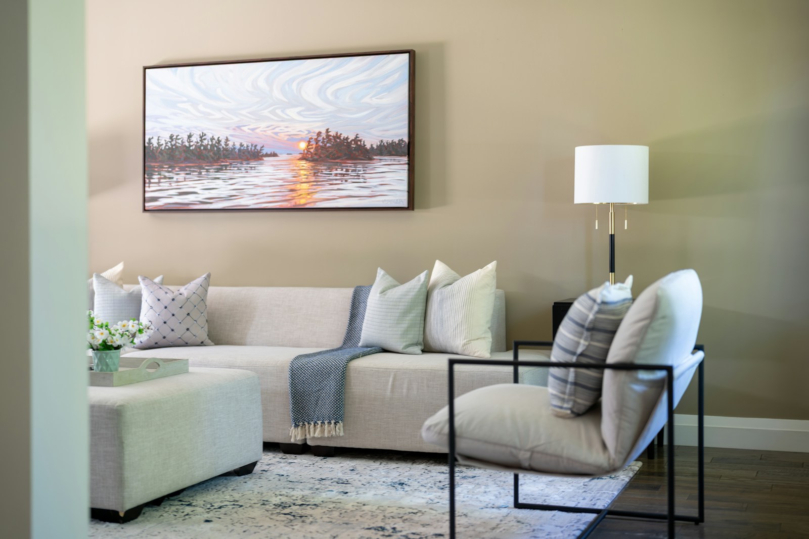
A light monochrome palette needs a dark focal point. Without it, the eye has no reference scale and reads the piece as a flat, uniform color. But be careful: one focal point, not five. The most common mistake is to scatter black everywhere "to create rhythm," which doesn't create any rhythm at all and muddles the monochrome effect.
Matte black and dark wood: the anchor that structures the room
Matte black is the most solid anchor: a floor lamp with a slender stem, a mirror frame, the legs of a coffee table, a shelving unit. Always choose it. mast — A glossy black reflects light and stands out in a powdery environment. And concentrate it on one axis of the room rather than dispersing it: a strong vertical is better than six small touches.
THE dark wood is the warmest anchor, and often the most fitting on this site. Walnut, antique teak, mango wood, smoked oak: a single piece of furniture in a dark wood—a sideboard, a coffee table, a console—warms up an entire room. white and beige living room where black merely structures it. My honest advice: use only two types of wood in the room, a light dominant one and a dark one as accent. Three different types, and the room becomes a carpenter's display.
Terracotta, sage green, ochre: the perfect touch of color
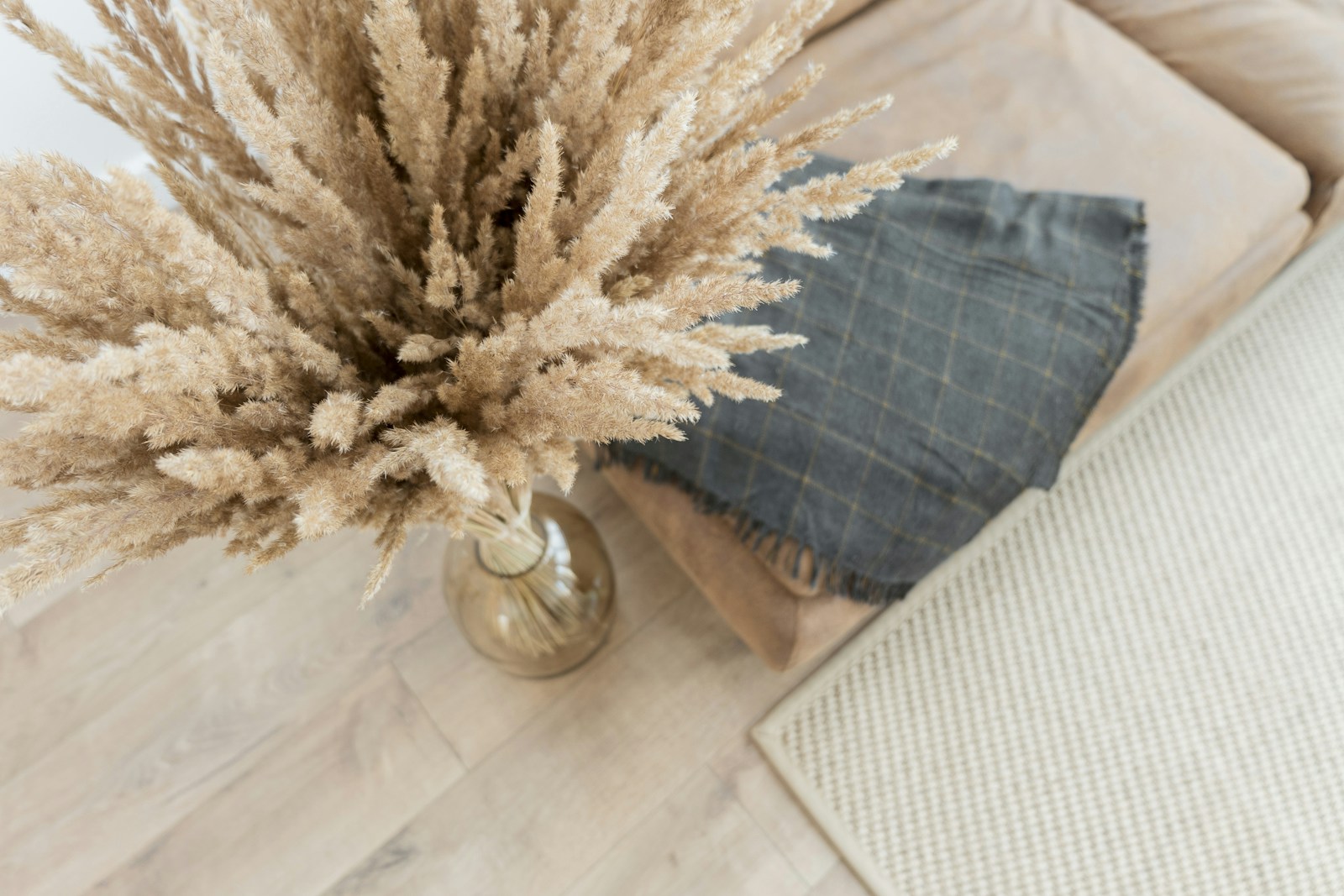
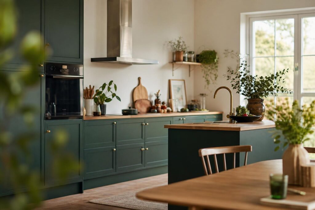
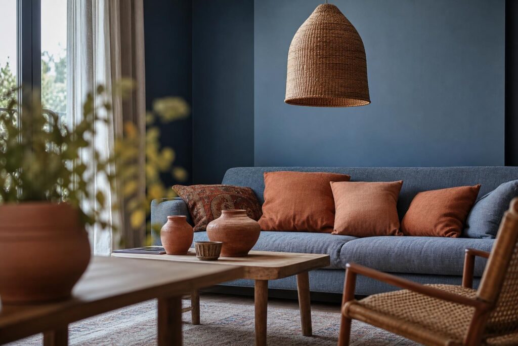
The colors that fit within a beige palette are those that share its warmth or that come from the same natural register. terracotta And ochre works because they are, literally, beige with a higher concentration of earth pigment. sage green It works because it's greyish, so it never clashes with ecru. Rust, turmeric, and dusty rose belong to the same earth family. These should be limited to a maximum of three objects, preferably in matte materials: ceramics, dyed cotton, colored blown glass.
An important distinction: we're talking about a touch that extends the monochromatic scheme, not a harmony of contrasting colors. Complementary pairs—beige and deep blue, for example—follow a different, more contrasting logic, which we'll discuss in a dedicated article on complementary colors. And if you're looking to find out what's in this season, check out our guide to... trendy colors for the living room already covers that area. The light monochrome, on the other hand, has the good sense not to depend on any season.
As for the GoldenIt operates in a category of its own: brushed brass and bronze are not colors but reflections. Two or three pieces—a lamp base, a handle, a small frame—provide precisely the touch of brilliance that a matte interior lacks, without ever feeling like an additional color.
Light, the ultimate arbiter: in the north they turn gray, in the south they turn yellow

You can choose the most beautiful palette in the world and watch it crumble once it hits the wall. Light colors are the most sensitive to light, precisely because they contain very little pigment: the slightest reflection from the environment shifts them. The same sand will appear golden in a south-facing living room and vaguely pink in an east-facing one.
Read about its orientation before choosing its shade
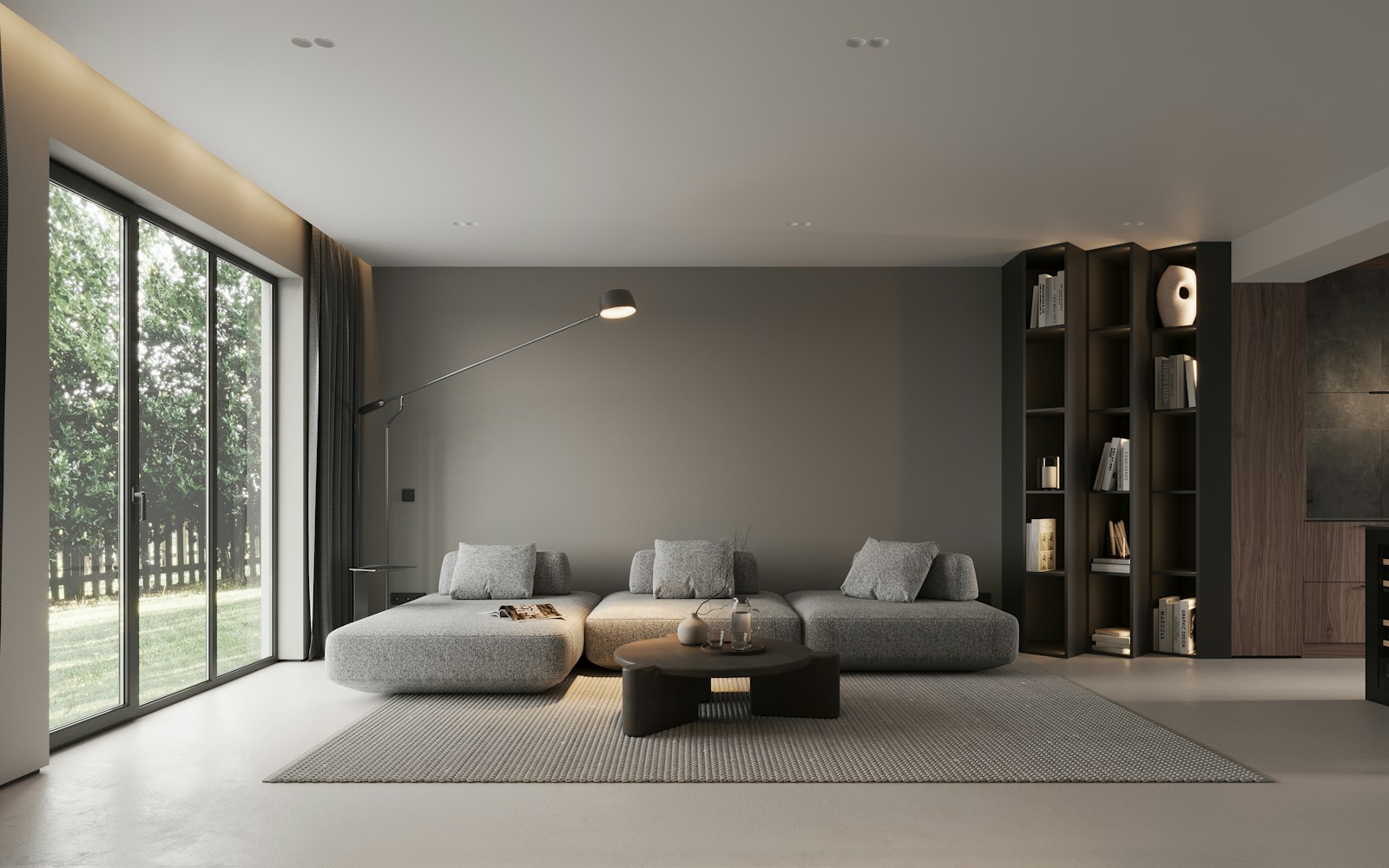
A room at north It receives indirect, cold light all day. Beiges lose their warmth and become closer to gray: a taupe will become decidedly dull, and that's precisely where the grey beige living rooms endured rather than chosen. The correction consists of taking warmer shades than those you like on the color chart - a sand where you would have taken an ecru, an ecru where you would have taken a pure white.
A room at south The opposite problem arises: direct sunlight saturates the yellows already present in beige, and a generous amount of sand can shift towards gold by late afternoon. In this case, the tone drops a notch towards lighter shades of gray or pink. Orientations East And west These are the most variable: bright light in the morning or evening, flat light the rest of the time. They handle pivotal shades well, especially greige.
How to test a beige color before painting the entire living room?
Never on a paper sample held in your hand, never on a ten-centimeter square. The method that works: paint two coats on a large sheet of cardboard at least half a meter square, then move it around the room and observe it at three times—in the morning, mid-afternoon, and evening under artificial light. A beige that was rejected in the evening but perfect at midday is the most common scenario.
Also consider the color temperature Consider the color temperature of your light bulbs, expressed in Kelvin: very warm light yellows off-whites, while neutral light preserves them better. And use several low-level light sources—table lamps, wall sconces, a reading lamp—rather than a single ceiling light. A ceiling light flattens all the textures you've carefully chosen; grazing light sources, on the other hand, reveal them by casting shadows on the contours.
Living in a bright living room: what maintenance really entails
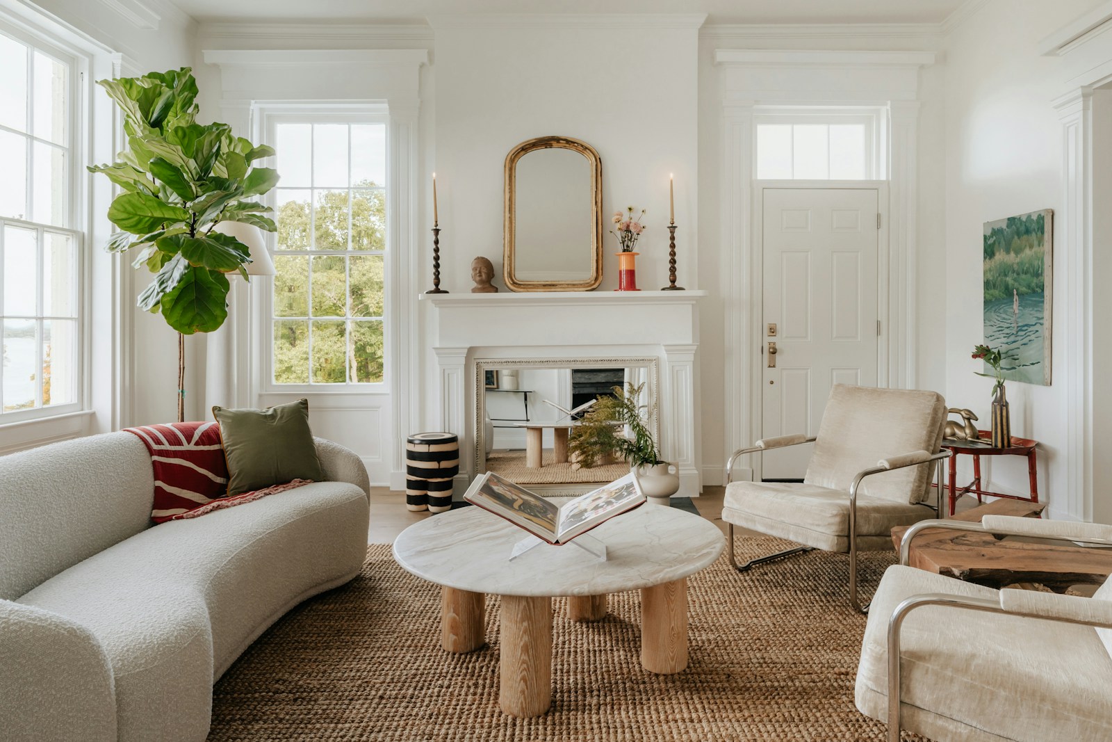
Let's be direct, because it's the question everyone's asking without actually saying it: is a white and beige living room a sensible choice for a family with children or a dog? Yes, provided you stop choosing your fabrics based solely on a photo. A light-colored interior doesn't require more maintenance than any other—it requires fabrics chosen to be cared for. That's the difference, and it's made at the time of purchase, not with the cleaning cloth.
Fabrics that forgive, fabrics that forgive nothing
Two criteria decide everything: the removable cover and the texture of the fabric. A washed ecru linen, a thick cotton, a removable and machine-washable cotton-linen blend withstands family life without flinching—and the natural creases even mask the wrinkles of everyday wear. Conversely, light-colored, non-removable velvet, silk, and very fine, smooth weaves absorb everything: the slightest friction leaves a shiny mark that won't disappear.
Counterintuitive but verifiable by touch: a slightly heathered or textured fabric hides marks far better than a perfectly plain one, because its grain fragments the light and blurs stains. This is something I always look at first, even before the color. If you're at the selection stage, our guide to Choosing the right sofa details the criteria for covering and filling.
With children or a pet: three points to be aware of

- The rug, first of all. This is the most exposed item. Jute and sisal can withstand foot traffic but retain liquids; tightly woven wool is easier to clean. In either case, choose a heathered rather than a solid color, and never pure white.
- The low seats and the armrests. These are the areas of constant contact. A washable cover on these items makes a world of difference, even if the rest isn't.
- The floor and the baseboards. Light-colored oiled parquet flooring can be touched up locally, while light-colored laminate flooring shows marks permanently. And a white baseboard with a satin finish can be wiped clean, whereas a matte baseboard shows fingerprints.
One last word about wear and tear, because it changes how we see everything. A light-colored living room visibly ages—linen develops a patina, wood lightens in the affected areas, jute loses a few fibers. This isn't degradation; it's life settling on the materials. A lived-in, slightly imperfect interior moves me infinitely more than a sterile, sterile setting, and that's precisely what natural materials do better than any others: embrace time.
The question of layout remains—where to place the sofa, how to organize the flow of movement, what to do with a very small or perfectly square room. This is a whole other field, the geometry of the living room, and it will be the subject of a separate article: a light color scheme works in any configuration, provided that the principles of materials we have just discussed are respected.
Is your color scheme in place? All that's missing are the curtains, and they're what filter all the light into the room.
See our trendy curtainsFAQ: Your questions about the white and beige living room
What color cushions should I choose for a beige sofa?
Three color palettes work well with a beige sofa: lighter or darker neutrals (off-white, ecru, taupe), an earthy touch (terracotta, ochre, rust), or a plant-like green such as sage. Above all, vary the materials: a bouclé cushion, a washed linen one, a corduroy one.
How to warm up a beige living room?
Add texture before adding color: a jute or thick wool rug, a bouclé wool throw, dark wood on a small table, rattan. Then add warm lighting, in several low spots rather than a single ceiling light.
What color curtains would suit a beige living room?
The safest option: a curtain in a shade very close to the wall, or a shade lighter or darker, in linen or washed cotton. The fabric blends into the room, and it's the drape that's noticeable. A contrasting curtain breaks up the walls and visually shrinks the room.
White or beige living room: which to choose?
White alone makes a space feel larger but quickly cools it down and shows every mark. Beige alone warms it up but flattens it if it's uniform. Combining the two is the safest option: white to create a sense of spaciousness in the upper areas, beige to create a warm, enveloping feel in seating and textiles.
What type of wood goes well with a white and beige living room?
Light oak and ash blend seamlessly into the color scheme, gently expanding the palette. Walnut, teak, and mango wood provide the warm contrast that is often lacking. Ideally, only two wood species are used: a dominant light wood and a dark wood as accent.
Does grey go well with a beige and white living room?
Yes, provided you choose a warm gray, leaning towards beige or taupe. A cold, bluish gray dulls beiges and gives the impression of a faded room. A successful gray-beige living room uses grays that visibly contain brown.
A white and beige living roomUltimately, it's an exercise in patience: fewer colors, therefore more attention to what the textures tell. Start with just one thing—replace a smooth fabric with a textured one, add a dark object—and watch the room change before going any further. That's often all it needed.