Our article in brief
- In a toilet, the color It doesn't make the room bigger: it gives it character. It's better to embrace it than to suffer a blank space by default.
- THE deep shades (fir green, midnight blue, clay brown) work remarkably well in a small space, provided that the lighting is carefully managed.
- A 2-colour toilet paint, with a base or accent wall, structure one square meter without weighing it down.
- Product side: a satin or velvet finish, washable and suitable for damp rooms, rather than a matte finish that shows marks at the slightest touch of a sponge.
The bathroom is the room we decorate last, often reluctantly, and almost always in white. It's a shame: it's also the only room where we can be completely daring without risking living with it for twelve hours a day. One square meter, two solid walls, a door that closes: the perfect playground.
At my place, the toilet is windowless, without a single window, and for a long time I thought it absolutely had to be brightened up. I ended up doing the opposite. That's what I want to talk to you about: what painting in the toilet choose really — the shade, but also the finish, the one that nobody talks about and that decides how the wall will look in two years.
What color paint should I use in a toilet?
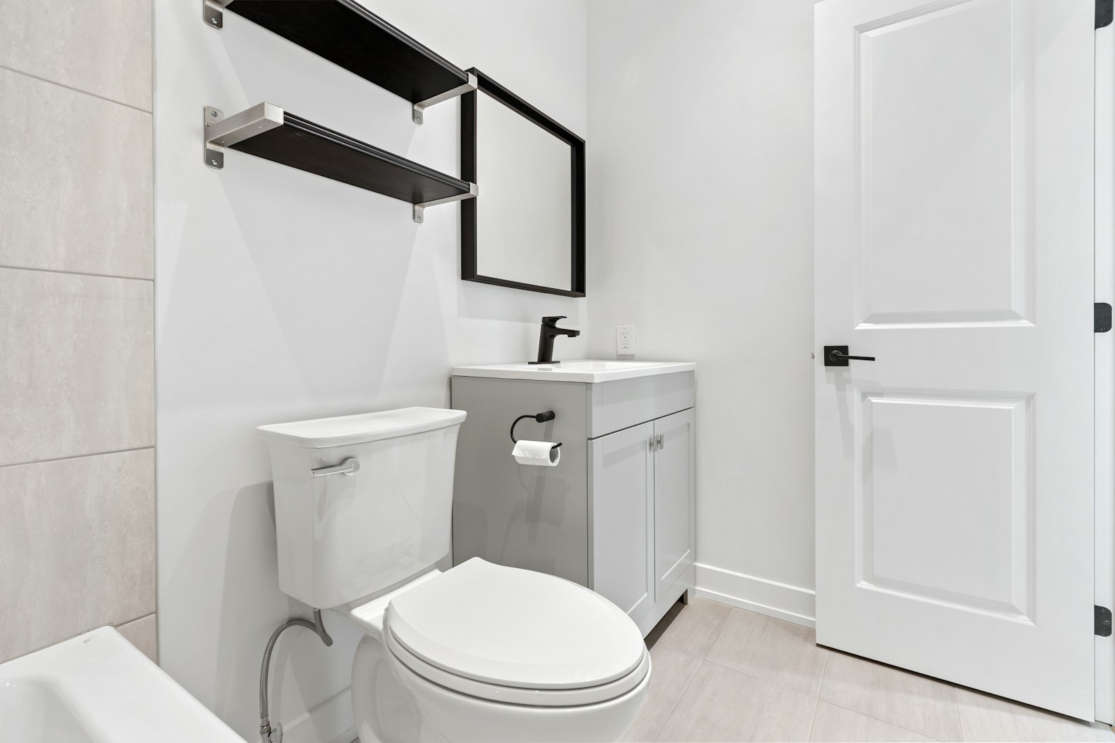
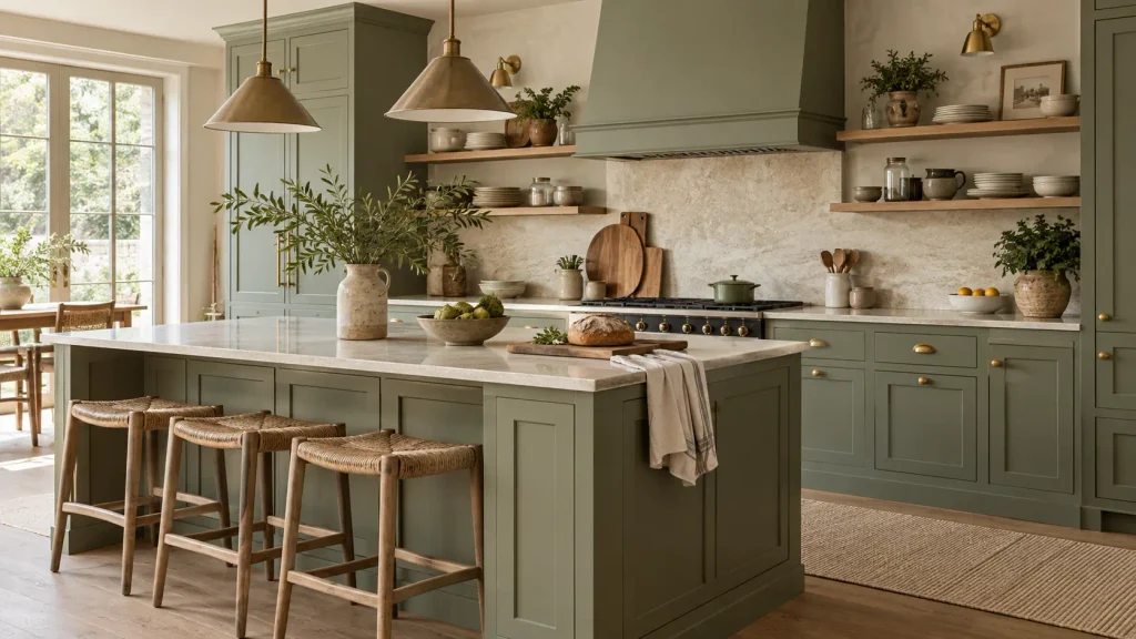
In a restroom, the right approach isn't to look for a shade that makes the room appear larger, but rather one that complements the existing dimensions. off-white and pearl grey soothe and reflect light; the sage green, The terracotta and deep blue give character to a room that one only passes through for thirty seconds.
The fundamental difference with a living room is the distance. In a large room, you judge a color At three or four meters: it dilutes, blending in with a sofa and a rug. In a toilet, it arrives all at once, fifty centimeters from eye level. One warm tint, A color chosen "so as not to make a mistake" will appear bland; a bold color takes on an intensity it would never have elsewhere.
Windowless toilet: is white really the right answer?
It's the number one reflex, and it's defensible: without natural light, we try to capture every photon. Except that a pure white, Illuminated by a single bulb in the ceiling, it doesn't become bright — it becomes grey. Having no daylight to reflect, it absorbs the tint of the bulb and reveals every cast shadow, every joint, every fingerprint.
In a windowless room, two approaches work best. The first: a warm white, Eggshell, linen, chalk—a white that contains a touch of yellow or red and responds well to warm artificial light. The second, more radical approach: abandon the illusion of brightness and go decidedly dark, compensating with lighting. Between these two extremes, dull mid-tones (grayish beige, mouse gray, muted taupe) almost always disappoint. Also, be wary of the bulb's color temperature: too cool, and it will turn greens khaki.
The main families of colors and the effect they produce
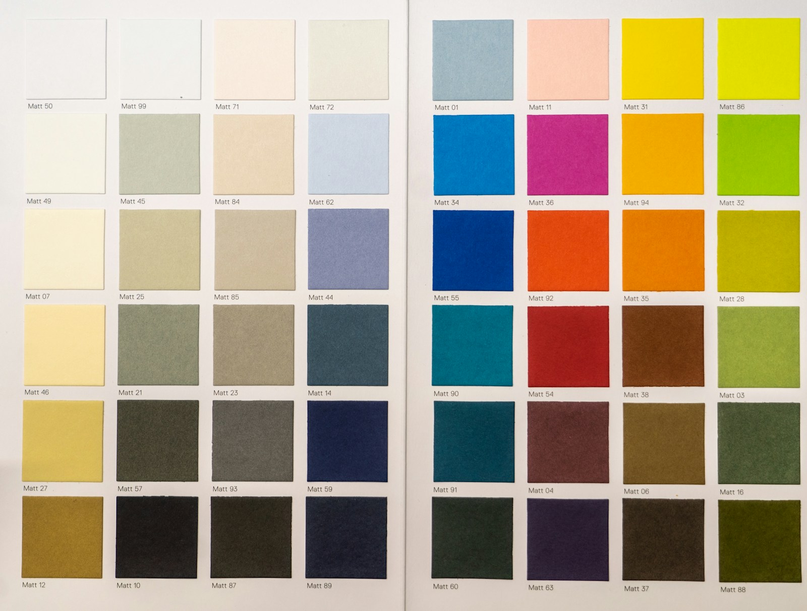
Rather than a list of trendy colors, here's how I reason: each family of hues produces a specific effect in a small volume, requires a certain amount of light, and goes well with certain materials.
| Family of colors | Effect in a small toilet | To be paired with | Point of vigilance |
|---|---|---|---|
| Warm whites (chalk, eggshell, flax) | Neutral lighting lets the objects take center stage. | Light wood, rattan, crumpled linen, cement tiles | It gets dirty quickly near the light switch and the toilet. |
| Soft greens (sage, almond, eucalyptus) | Soothing, plant-based, very easy to live with | Brass, terracotta, plants, blond wood | Turns khaki under too cold a light |
| Deep greens and blues (fir, duck, midnight blue) | The room feels more intimate, like a jewel box. | White bathroom fixtures, mirror, brass, light floor | It requires good lighting, otherwise the room closes in. |
| Earths and clays (terracotta, brick, red ochre) | Instant warmth, enveloping atmosphere | Dark wood, jute, handcrafted ceramics, rattan | It might clash with very grey floor tiles. |
| Blacks and anthracites | Graphic, contemporary, very photogenic | Pure white, brushed stainless steel, polished concrete | Reveals dust and cleaning stains |
| Pearl grey and light taupe | Discreet, a safe bet, but not very memorable | Marble, chrome, heathered textiles | The effect is that of an "office corridor" if everything is grey. |
A common-sense observation: the toilet bowl and sink are almost always white, and you don't choose that particular shade of white. It's simply part of your color scheme. Against a dark wall, it stands out like a crisp punctuation mark; against a warm beige, it just looks cleaner than the wall.
- Choosing a shade on a screen, never tested on site: the most frequent mistake.
- A large-scale pattern abruptly cut off by the door or pipe cover.
- Three different colors in one square meter: the eye has nowhere to rest.
- A mast deep on the areas that are touched: handprints appear in a few weeks.
Dare to go dark: why it works in 1 square meter

A dark shade In a bathroom, it doesn't shrink the room; it erases its boundaries. The angles disappear, the eye no longer measures the walls, and the space becomes enveloping instead of cramped. It's the most effective decorating trick for a toilet, and one of the least expensive to try.
We need to dispel a persistent misconception: "dark = smaller." This rule applies to a room where you want to breathe, not to a tiny one-square-meter space. Here, the brain no longer perceives walls as measurable surfaces but as a continuous envelope: edges fade and we cease to be aware of the cramped quarters.
In a room of one square meter, color doesn't make it look bigger: it tells a story. And it tells a powerful story.
The jewel-box effect: when a lack of perspective becomes an asset
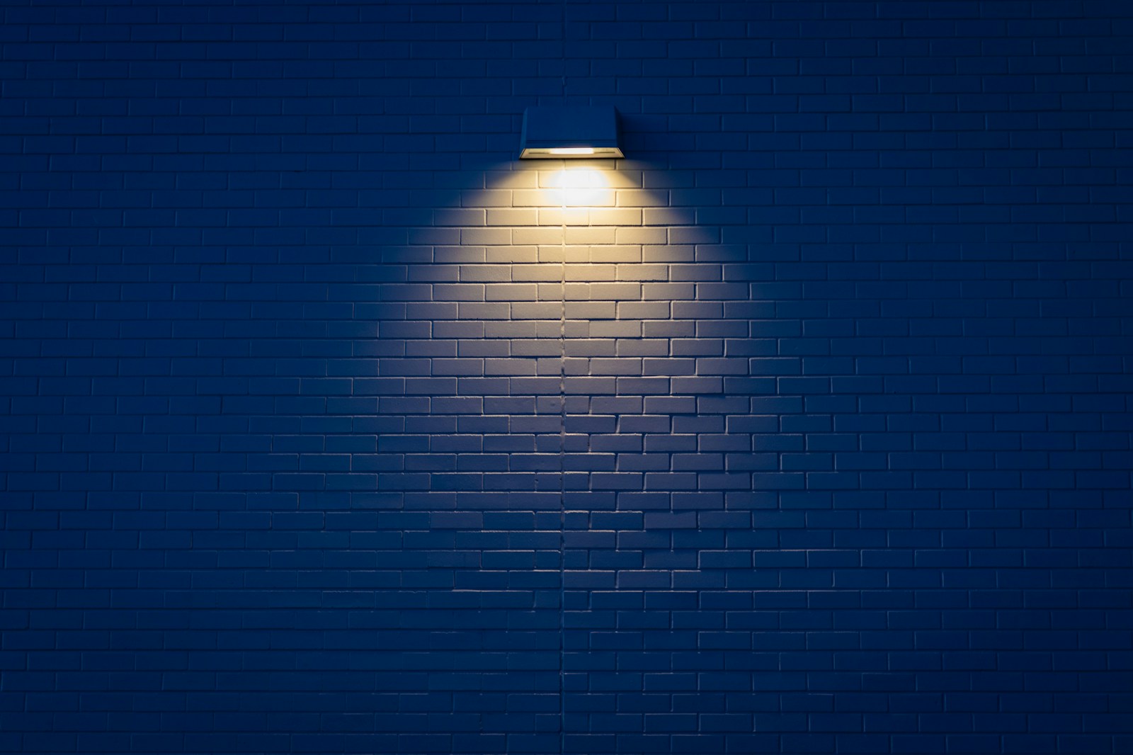
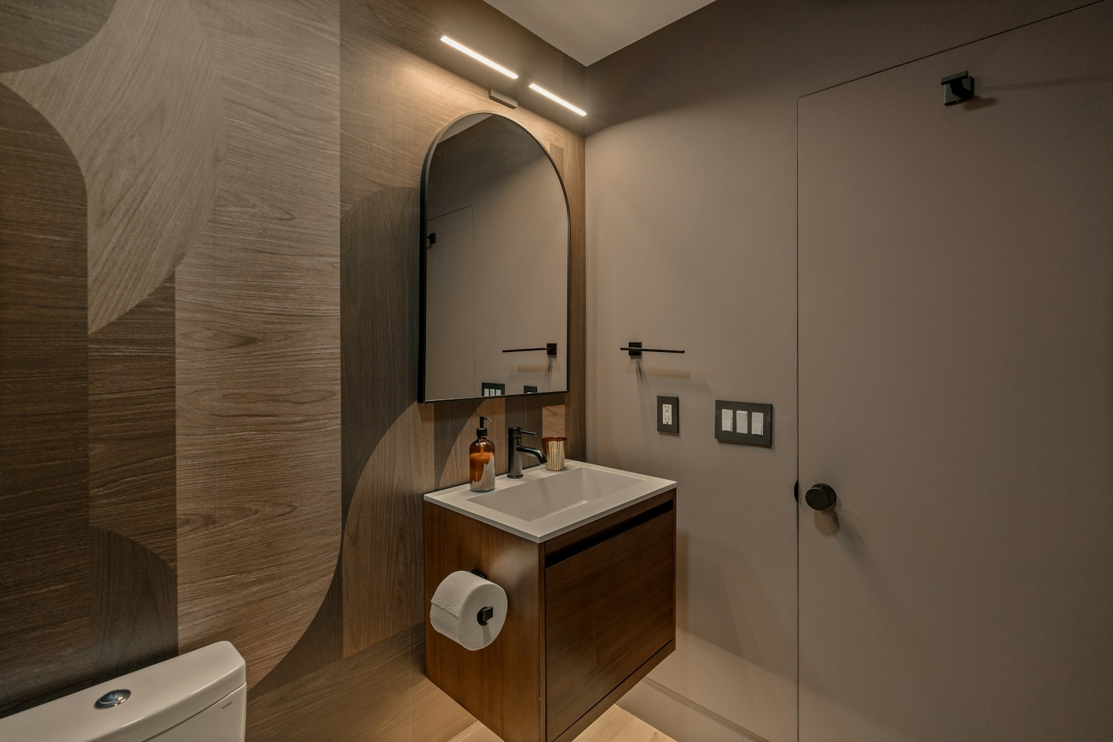
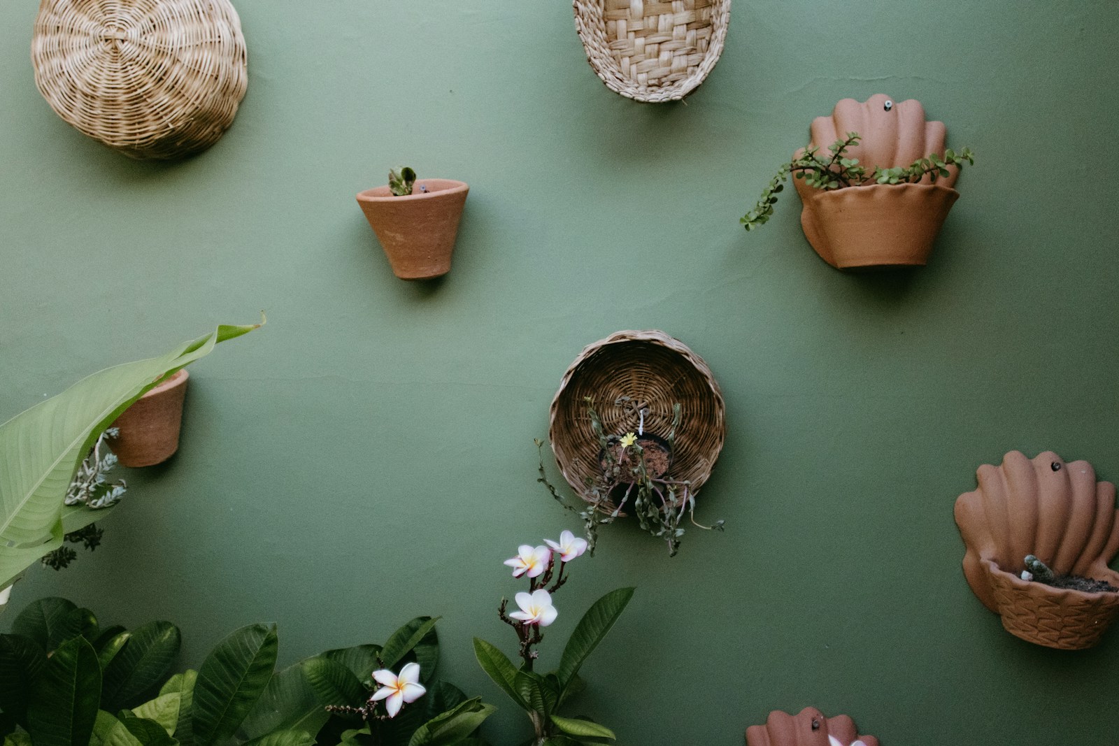
The principle is that of a jewelry box: a dark background against which light-colored objects stand out. In a bathroom, these objects are already there—white ceramic tiles, a mirror, a brass towel rack, a small framed print. On a pale wall, they blend into the decor; on a fir green or a midnight blue, each one becomes a point of connection.
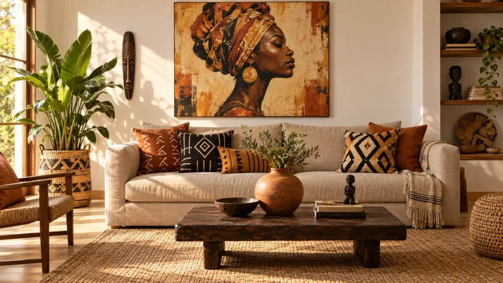
The same logic applies to materials: dark colors highlight the grain of the wood, the weave of caning, the irregular surface of a hand-thrown ceramic. This is exactly the style I love—an earthy or leafy hue, a handcrafted object, and the rest very understated. If this resonates with you, check out our notebook on the ethnic chic decor provides other avenues for associations.
What the dark one demands in return
Darkness doesn't forgive improvisation. First the light A bare lightbulb on the ceiling casts harsh shadows and flattens the color, whereas a wall sconce or spotlight directed at the wall transforms the effect. Then there's a touch of white—baseboards, door frames, bathroom fixtures—without which the eye has no reference point. Finally, warm materials like wood, rattan, jute, and brass prevent the darkness from becoming cold.
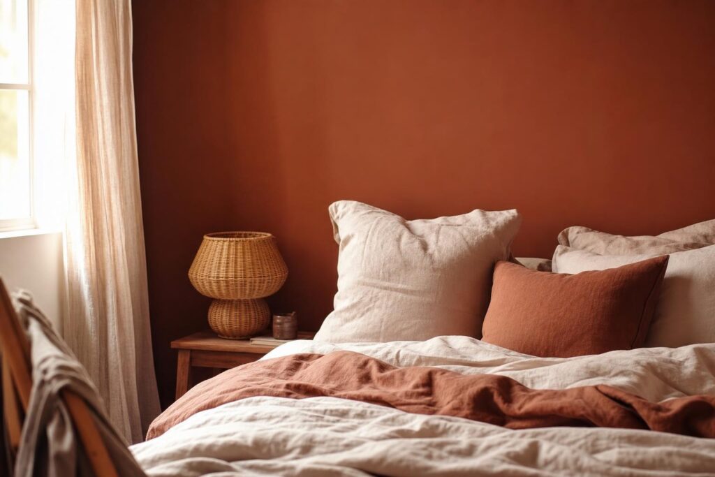
A nuance on the terracotta These are warm, dark shades, much easier to live with than black, and terracotta flatters artificial light where very cool blues accentuate it. If you're hesitant to take the plunge, it's the gentlest introduction to bolder hues. To identify the current color trends, see our overview of... decor trends 2026 can help to decide.
Two-color bathroom paint: baseboards, accent wall, ceiling
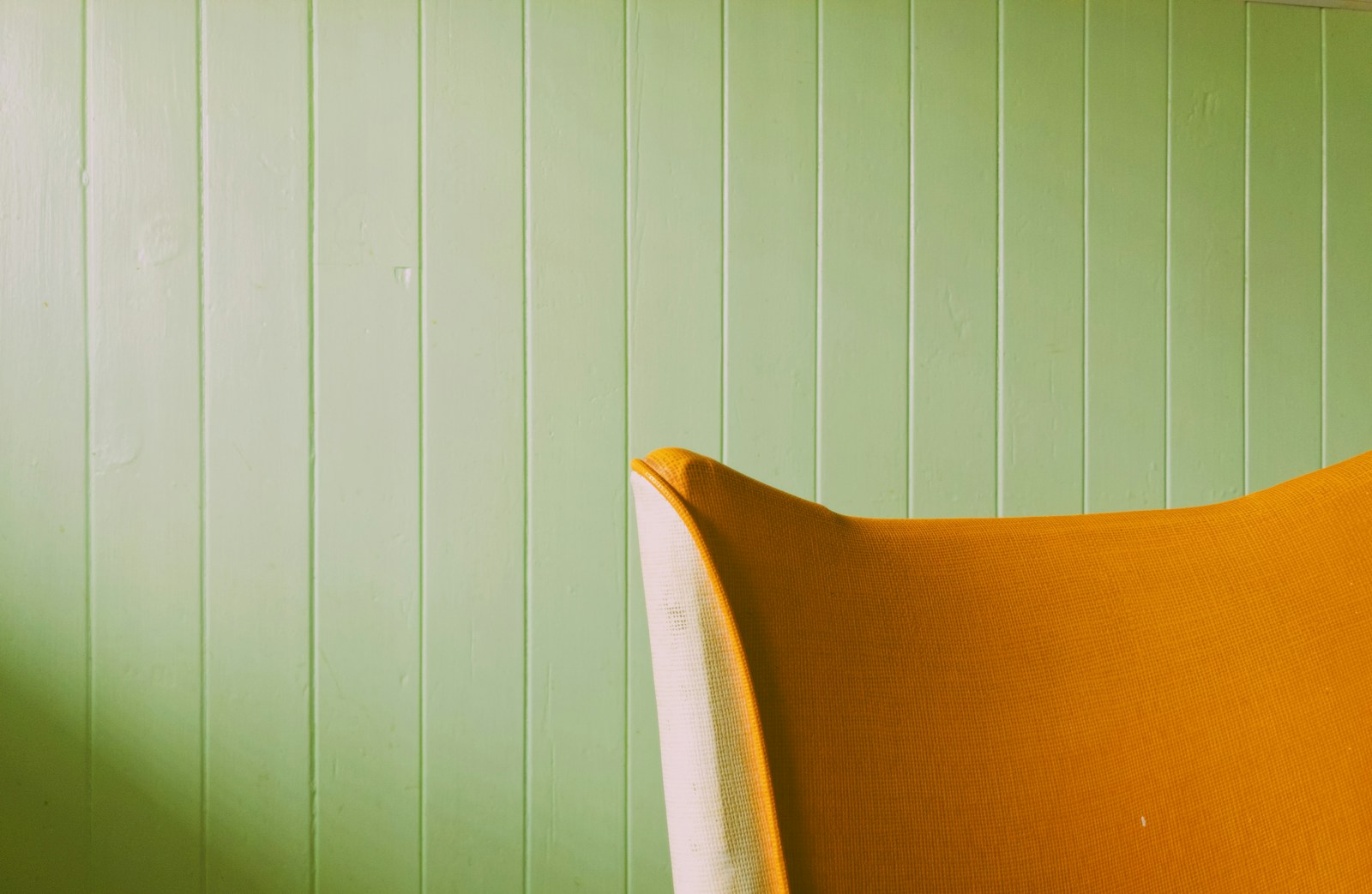
Painting toilets in two colors The technique involves dividing the wall into two zones: a darker lower section and a lighter upper section. Alternatively, you can color only one wall, or extend the color to the ceiling. Three simple steps, three very different effects on the perception of space—and a bolder approach that's much easier to pull off on half a wall.
The foundation: a safe bet
THE base, This refers to the lower part of the wall, treated in a darker shade, like painted wainscoting. It comes from the tradition of old houses, where this strip protected the walls from wear and tear and moisture. In contemporary restrooms, it serves the same practical function—it's the height for hands, bags, and a toilet brush—while also adding a touch of graphic elegance.
The classic coordinate system places the dividing line around the lower third of the wall, At waist height. Two tips: never place it exactly in the middle, the effect is immediately childish; and align it with an existing element—the top of a pipe cover, a water tank, the edge of a towel warmer. A tape measure is sufficient, but a thin strip of wood glued on and then painted will hide the slight unevenness that always occurs when drawing by hand. The safest combinations: terracotta and chalk white, fir green and linen, anthracite and pearl gray.
Which wall should I paint in color?
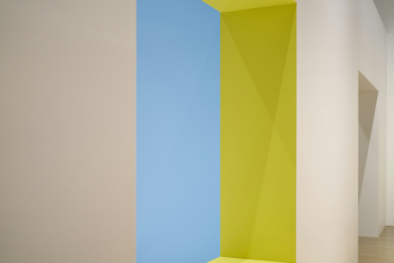
If you are only painting one wall, take the back wall, The one you see when you push open the door, usually the one with the toilet bowl. It catches the eye, creates a sense of depth, and allows the side walls to breathe. It's the most visually appealing choice in a long, narrow toilet.
The layout refines this choice. In narrow, deep toilets, almost like a corridor, coloring the back wall visually shortens the tunnel. In more square toilets, it's both side walls The color and light background create a beautiful sense of intimacy. And if the room has an alcove or a utility closet, that's where the color should be applied: the relief makes the effect immediately believable.
Should the ceiling be painted?
It all depends on the height. Many toilets installed under a staircase or in a former hallway have a ceiling Disproportionate to their size: the room resembles a well, and a strong color on the ceiling breaks this verticality. Conversely, in bathrooms with low ceilings, the most elegant solution is to use the same color on the walls and ceiling, without any break: the upper boundary disappears, and with it the feeling of confinement. White is still perfectly acceptable—simply the least expressive of the three.
Which paint for the toilet: finish and durability
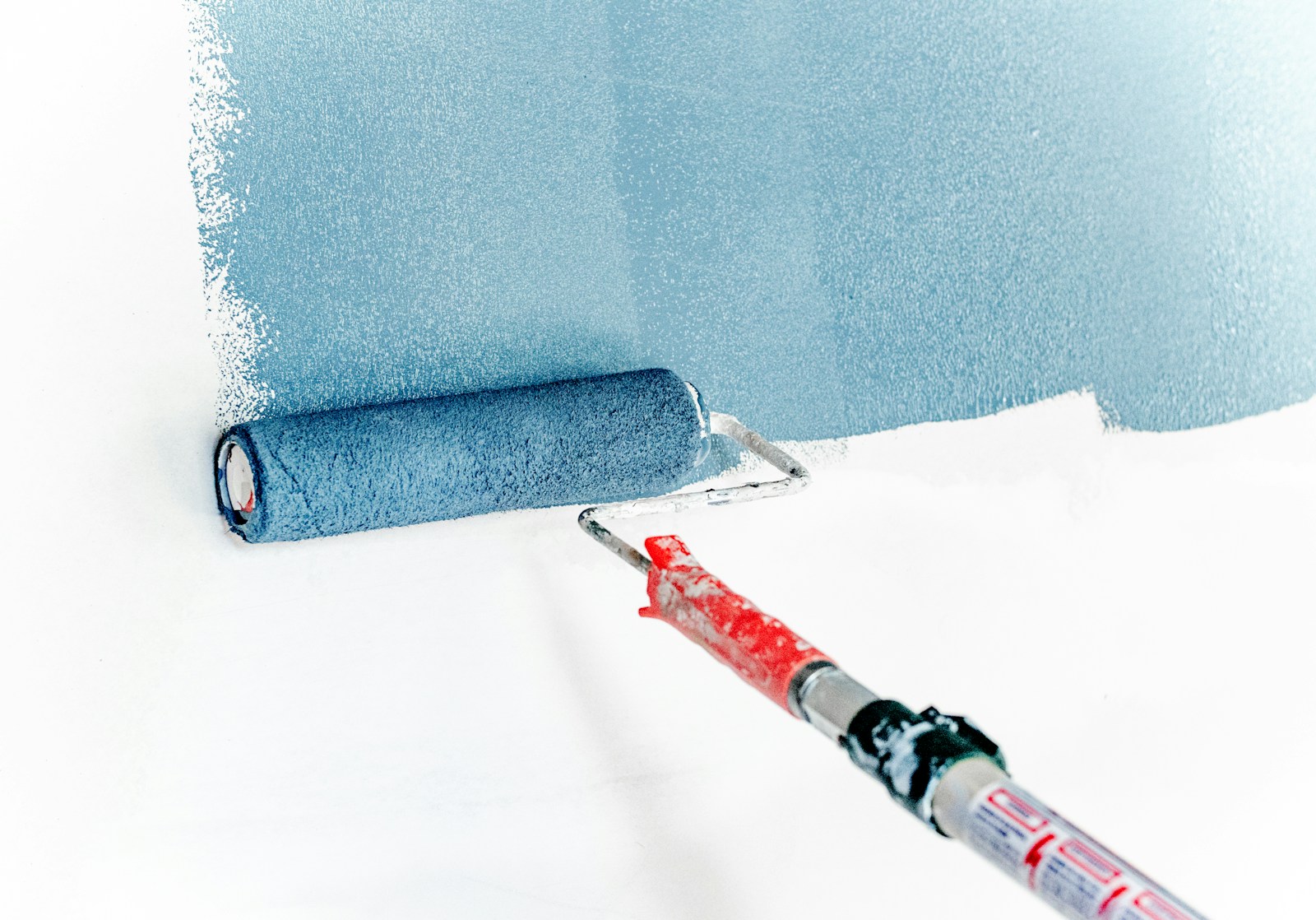
For the toilet, we choose a acrylic paint in satin or velvet finish, washable and suitable for wet rooms. These finishes form a more closed film than matte: they withstand wiping with a sponge, absorb condensation and retain their appearance near areas that are touched every day.
This is the point that inspirational articles almost always forget. The color makes the photo; the finish determines its durability.
Satin or velvet: why matte is a trap here
THE mast It's magnificent: it absorbs light, gives depth to rich colors, and hides imperfections in the surface. But its surface is microporous: it retains moisture, splashes, and fingerprints, and the slightest smear with a sponge makes it shiny—you end up with a glossy area that's impossible to fix except by repainting the entire wall.
THE satin It gives off a subtle sheen, cleans up remarkably well, and resists moisture, but it accentuates the wall's imperfections. velvet This is the compromise I most often recommend: it has an almost matte appearance to the eye, is washable, and is much more forgiving on a worn cast. bright, This one, however, only belongs on the woodwork and the door. And if you don't want to compromise on the matte finish, keep it high up, out of reach, and use satin on the lower part.
Washable, moisture-resistant: what that means
The words printed on the cans are not interchangeable. A paint called washable It tolerates a soft, damp cloth. A paint washable Accepts soapy water and moderate, repeated scrubbing over time: this is the minimum standard to aim for in a toilet. Special wet room ranges generally offer improved condensation resistance and mold-limiting agents.
But no painting can compensate for a ventilation faulty. If your walls are blackening in the corners or behind the tank, the problem isn't the paint: it's a lack of air circulation. Check that the vent of VMC It actually works — the piece of paper that's supposed to stay stuck to the grid still functions. Public recommendations on the indoor air quality They emphasize this point: ventilate thoroughly for at least ten minutes a day, summer and winter, and ensure continuous air renewal. Painting over active mold means repainting twice; if the moisture is coming from further away, our guide to renovating a bathroom addresses bodies of water more broadly.
The underlayer and emissions label
There undercoat It is essential on new plaster, filler, porous surfaces, or when transitioning from a dark to a light shade: it evens out the wall's absorption and often eliminates the need for a third coat. On an old gloss alkyd paint, lightly sand with fine sandpaper.
Finally, check the emissions label. On construction and decoration products intended for interior use, including paints and varnishes, a letter indicates the level of volatile pollutant emissions into the room's air. A+ (very low emissions) to C (high emissions): the rule is detailed on the official website of the’labeling of construction products. In such a small space, often without windows, aiming for A+ is a simple reflex.
Painting a toilet: the method in a small space
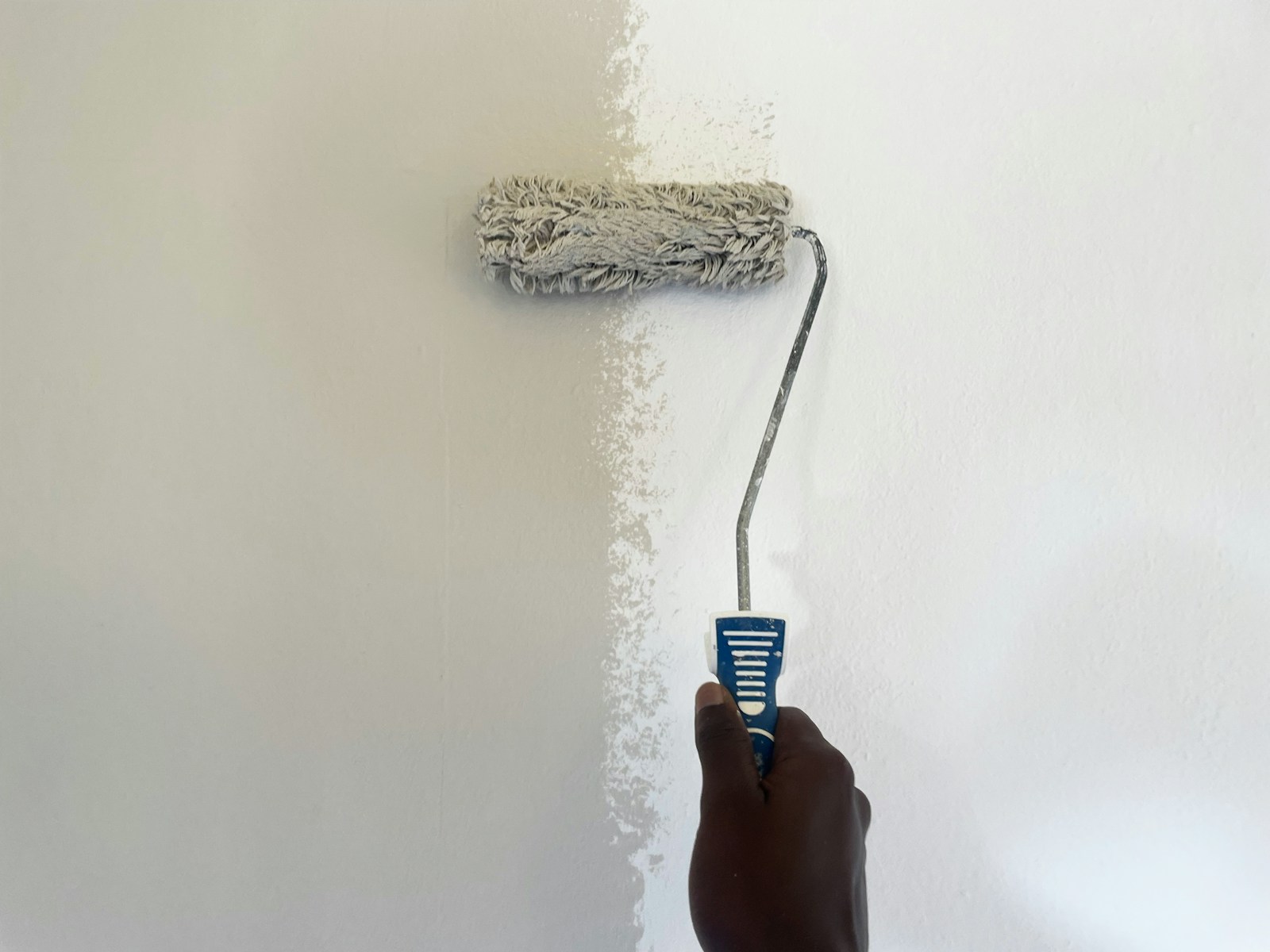
Painting a toilet rarely takes more than a weekend, but the difficulty isn't the surface area: it's the clutter. You dismantle everything that can be removed, protect the toilet bowl, paint the ceiling first, then the walls from top to bottom, keeping a mini roller for the rear of the tank.
Good news: the surfaces are so small that a modestly sized pot is usually enough for two coats. Not so good: you're working at arm's length, with no room to step back, around a ceramic obstacle that can't be moved. Hence the importance of preparation, which will take longer than the painting itself.
What you prepare before opening the jar

- Disassemble everything that can be unscrewed: roll holder, hook, shelf, mirror, switch cover. Each object left in place becomes an outline to be cut out with a brush.
- Remove the’toilet seat If the hinges allow it: you will gain clear access to the back of the toilet bowl.
- Fill the old holes with filler, sand lightly, and dust with a damp cloth.
- Wash the walls, especially at hand height and behind the door, where the greasy film is invisible but very real.
- Protect the toilet bowl and hand basin with plastic film, cover the floor, leave the ventilation system running and work with the door open.
A word about the pipe cover: if it's removable, take it down and paint it flat; the result will be much cleaner. If it's fixed, decide right away whether it should blend into the wall color or stand out in a contrasting shade.
The order of actions when you can't back down
- Apply the undercoat if the surface requires it, and respect the drying time indicated on the can.
- Paint the ceiling first, whatever its color: the overspray falls, never the other way around.
- Trace all the cuts to detail brush — corners, ceiling perimeter, baseboards, door frame — before taking out the roller.
- Roll the roller wall by wall, crossing the passes and starting again on a still fresh area.
- Treat the rear of the tank with a mini roller, without seeking perfection on what cannot be seen.
- Let it dry, then apply the second layer : it is what gives the depth of the shade.
- Finish with the door and woodwork, and remove the masking tape before the film is completely dry.
If you have removed the toilet seat and wish to replace it, our step-by-step guide will help you. install a toilet seat with a soft-close mechanism This will help you avoid common repositioning errors.
💡 Tip — Before buying your paint, apply two coats of the desired shade to a piece of cardboard the size of an A3 sheet, then tape it to the bathroom wall. Look at it in the morning, then again in the evening under real lighting, with the door closed, and move it from the back wall to the side wall: this is the only reliable way to validate a shade in a windowless room.
One last thing: don't judge your work that same evening. A bold color needs to dry completely to reveal its true depth, and your eye needs two or three days to adjust. The doubt of the first evening is almost a ritual—it passes.
Is the paint dry? Now for the details that make the room
See our modern bathroom decorating ideasFAQ: Your questions about painting in the toilet
What is the trendy color for toilets?
Three color families consistently reappear in current interiors: soft, deep greens, from sage to fir, terracotta and clay tones, and rich blues like midnight blue or duck egg blue. They work particularly well because they tolerate the artificial light of a windowless room.
What color should I use to make the toilet look bigger?
No single color actually makes a square meter appear larger. Light, warm shades, like chalk white or pearl gray, visually push back walls and are suitable if you're looking for neutrality. A well-placed mirror and grazing light will expand the perception of space more effectively than paint alone.
Paint or tiles in the toilet?
Painting remains the most accessible, quickest, and most reversible solution: you can change your mind in a weekend. Tiling is more of a commitment, both in terms of installation and lifespan, but unbeatable in high-traffic areas. Combining the two—tiling below and painting above—brings together the advantages.
Can you paint a toilet seat?
Technically yes, with a primer suitable for plastic or varnished wood, followed by a thin coat of lacquer. However, a toilet seat is constantly subjected to friction, cleaning products, and humidity: its durability remains uncertain. Replacing it almost always provides a more lasting and cleaner result.
Does green really work in toilets?
This is one of the safest color families, from almond green to fir green, because it naturally complements white bathroom fixtures, wood, and brass. Just one thing to be aware of: under a cool light bulb, a green can turn khaki. Test it in person before buying.