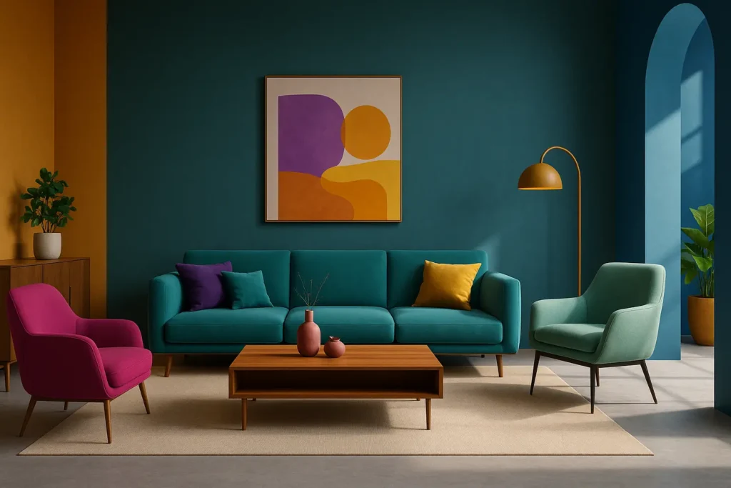
Our article in brief
- Two complementary colors face each other on the color wheel: blue and orange, red and green, yellow and purple.
- Side by side, they intensify each other. It's the strongest contrast that exists — and therefore the easiest to miss.
- In decoration, they are almost never used in their natural state: they are... Rabat in terracotta, sage, ochre, aubergine, greyish blue.
- The rule that saves everything: one dominant broad and calm, the complementary in touch on a small portion of the surface area.
- Two saturated shades in equal parts is the combination that goes wrong nine times out of ten.
There's an experiment everyone has done without thinking: placing a terracotta pot in front of a blue-gray wall and suddenly realizing that the two complement each other. It's not chance; it's geometry. These two shades are complementary : they occupy opposite positions on the color wheel, and this opposition makes them more vibrant together than apart.
The problem is that color theory often stops at the wheel and the simple school diagram. But what interests you isn't reciting the pairs: it's knowing which fit in a real living roomIn what quantity, and at what point does the agreement become jarring? That's exactly the program of this article — the theory in two minutes, then the practical application.
The color wheel, or why two opposites can agree
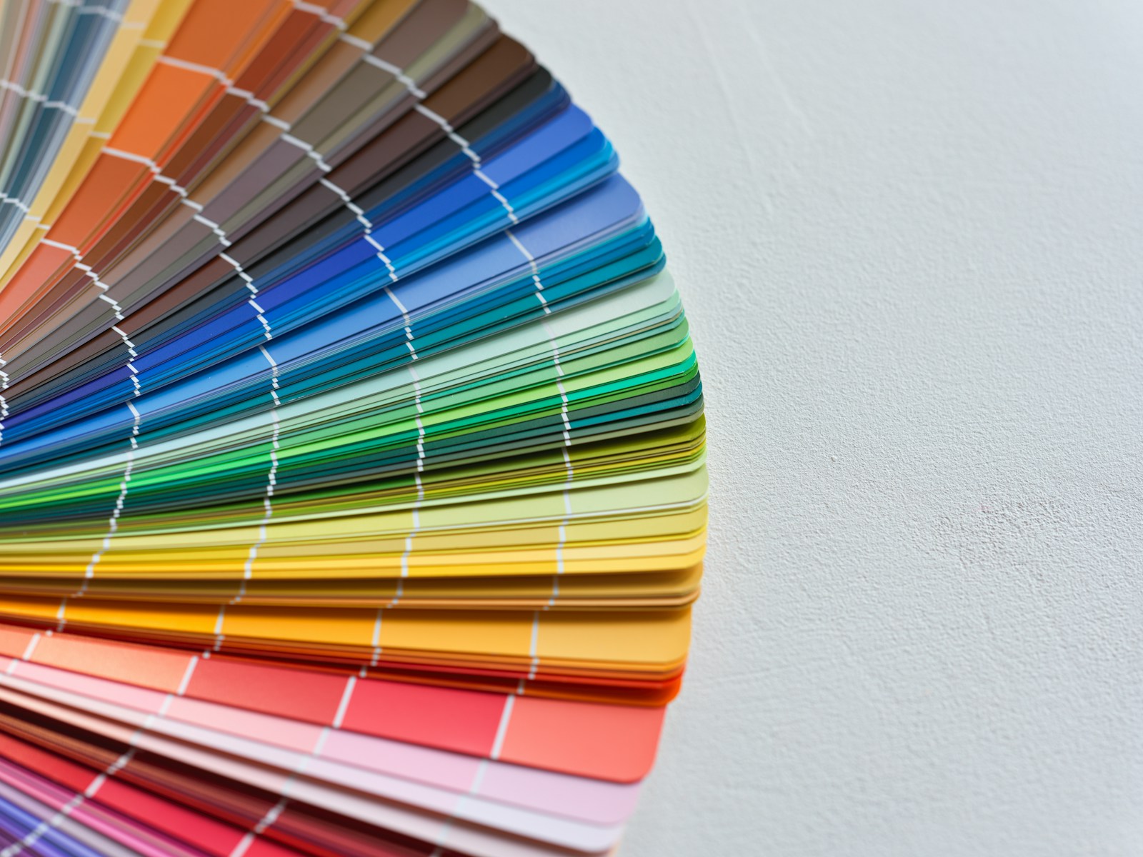
Before choosing anything, this tool must be kept in mind. color wheel It's a wheel that arranges colors in the order of the spectrum, without breaks, until the loop closes. Three primary colors in painting: red, yellow, blue. Mixing them in pairs produces the secondary colors—orange, green, violet—which are then inserted between them. Then the tertiary colors fill in the remaining gaps, and you get that circular gradient you see hanging in every studio.
What exactly is a complementary color?
A complementary color is one that is found diametrically opposite Find your color on this circle. Draw a straight line from the center towards your chosen shade, then extend it to the other side: you'll find its complementary color. Nothing more. The word "complementary" comes from this—when mixed as pigment, the two neutralize each other and produce a brownish gray, as if each provided the other with what it needed to be complete.
On the painter's circle, there are three main pairs to remember, and they are sufficient for 90 % decoration decisions:
- Blue and orange — the most common pair in our homes, often without us even naming it.
- Red and green — the most disliked, because it is mistaken for a Christmas tree.
- Yellow and purple — the sharpest one, the one that requires the most dexterity.
Between these three lie the intermediate pairs: red-orange opposite blue-green, yellow-green opposite red-violet. These are the ones we actually use most often, because they fall precisely into the shades that the trade calls rust, duck, sage, or dusty rose. A quick spelling correction, since the search results are often inconsistent: it is indeed written complementary colors, with accent and in the plural of both words.
Simultaneous contrast: each color transforms its neighbor
This is the point that school color charts overlook, and it's the most useful one at home. A color doesn't have a fixed value: it changes depending on what you put next to it. A slightly pinkish beige placed next to a seafoam green will appear distinctly pink; the same beige next to a bright pink will appear almost gray. That's why a paint sample that you liked in the store might disappoint you on your wall, between your floor and your sofa.
This phenomenon has a name, the law of simultaneous color contrastand it was formulated in the 19th centurye century by the chemist Michel-Eugène Chevreul, then head of the Gobelins Manufactory. Dyers complained of wools that "changed" color: he showed that the problem was not in the dye bath but in the eye, and from this he derived a color wheel that has remained famousTwo centuries later, this is still the best explanation for why your samples are lying to you.
Video: Understanding the color wheel (Pratiks).
The three pairs that really work at home
That's the real issue. On paper, a complementary color is a complementary color. In a lived-in room, with northern light, oak parquet flooring, and a sofa that's lasted ten years, some color combinations are incredibly forgiving, while others are completely unforgiving. The difference almost always comes down to a single step: switching colors. frank to its version folded downthat is to say, darkened, greyed, softened by a touch of its complementary color or earth tone.
Blue and orange: terracotta and grayish blue, the safest combination
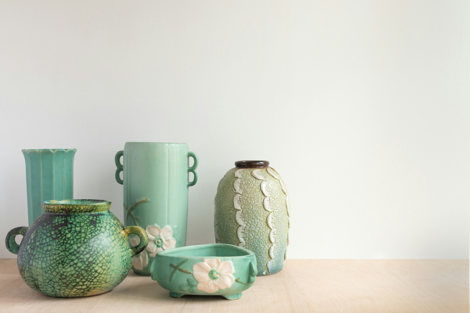
If you only have time for one, choose this one. It's my favorite combination, by far, because it's already half-done for you: the terracotta is a muted orange, and so is warm wood. All it takes is a blue-grey wall, a linen blue or a muted duck blue for everything brick, straw, rattan and pottery to start singing.
What makes this pairing so forgiving is the temperature difference: the blue visually recedes, the orange advances. You achieve depth effortlessly. In practice: a matte gray-blue wall, natural linen curtains, a terracotta-patterned rug, two or three pottery pieces. Nothing more. It's also the most compatible base for... trendy colors of the year, which have been revolving around ochres and dusty blues for several seasons.
Green and red: forget Christmas, think sage and terracotta
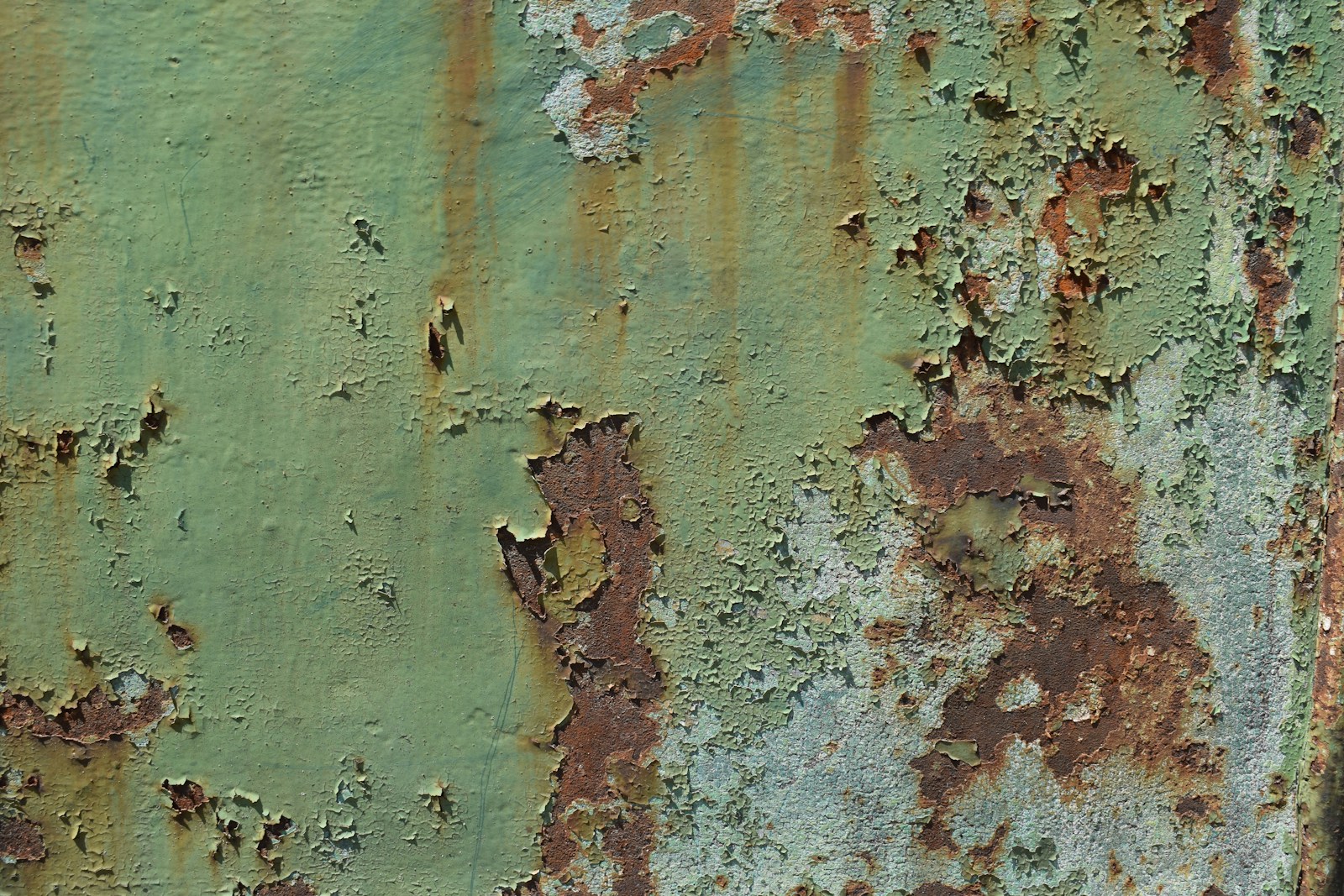
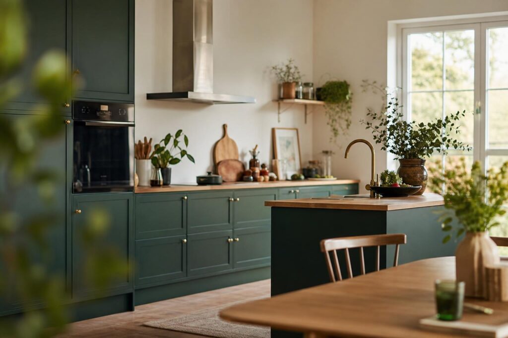
This pair suffers from a well-deserved bad reputation—but only in its most straightforward form. Grass green and tomato red, yes, it's a garland. Move both of them a notch towards the mute and you get one of the most elegant chords in existence: sage green or olive green on one side, terracottarust or brick on the other.
Why does it work? Because both shades have been toned down in the same proportion: they complement each other without clashing. Add some ecru linen, raw wood, a touch of brass, and you have a calm, natural feel rather than a festive one. It's a combination that works particularly well in a bedroom, where you're looking for contrast without any commotion—the same reasoning as for the most sought-after bedroom colors.
Yellow and purple: ochre and aubergine, the most delicate of the three
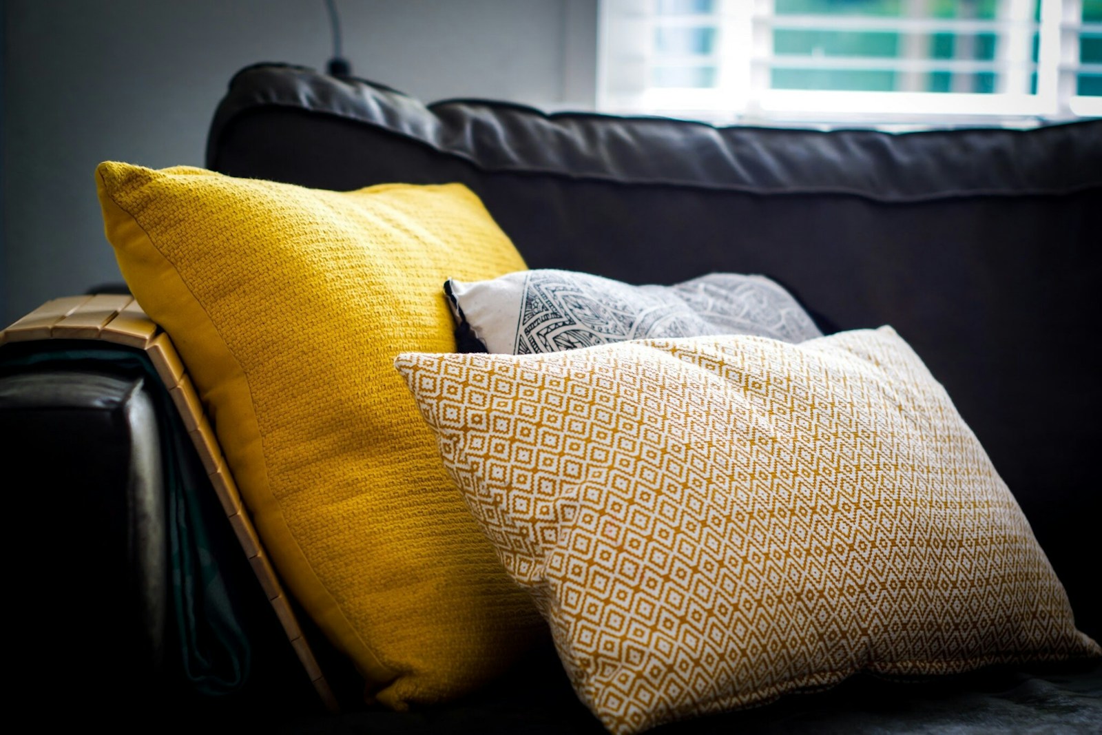
This is the most contrasting pair in the circle, and not just in shade: yellow is naturally light, purple naturally dark. The difference in brightness adds to the difference in color, and the result can be spectacular or downright jarring. In a decorative context, we're therefore talking about...ocher, mustard or curry yellow in the face of a eggplant, a plum or an almost black purple.
My recommendation here is strict: never divide the room in two. Deep purple works beautifully in large areas—an entire wall, a velvet sofa—while ochre works best in very small quantities: a cushion, a lampshade, the edge of a shelf. The reverse also works, but requires ample light; otherwise, large areas of ochre will turn into a dull mustard as soon as the daylight fades.
Find the complementary color to your existing color, shade by shade.
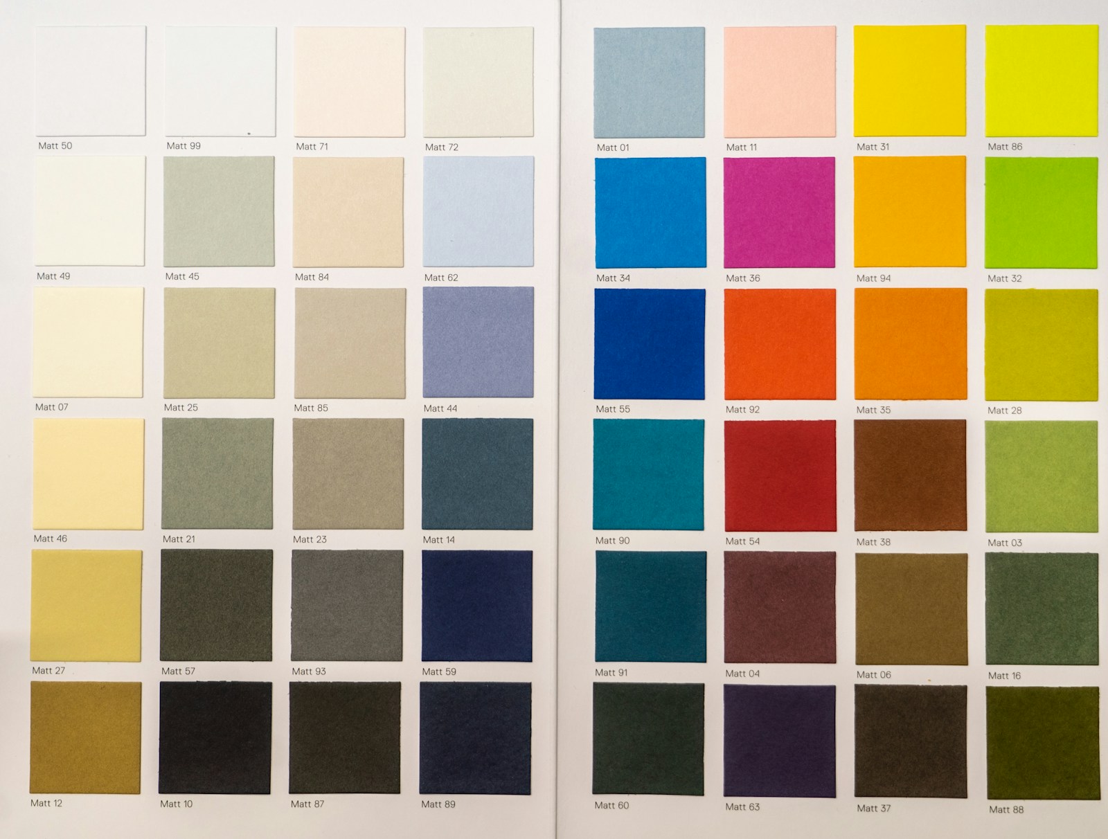
Do you already have a color you're committed to—a sofa, tiles, a wall you won't repaint? Then the question becomes: what is its complementary color, and how can you incorporate it into your home? The table below provides the theoretical answer and, most importantly, the translation decor usable. For a particular case, a interactive color wheel allows you to spin the wheel yourself in a few seconds.
| Your color | Its complement | The version that works in decoration |
|---|---|---|
| Blue | Orange | Greyish blue or duck egg blue × terracotta, rattan, honey wood |
| Red | Green | Brick or rust × sage, olive, khaki green |
| YELLOW | Purple | Ochre, mustard × eggplant, plum, fig |
| Orange | Blue | Terracotta × linen blue, slate blue |
| Green | Red | Aqua green, sage × old rose, sienna |
| Purple | YELLOW | Greyish lilac × straw, golden sand, linen |
| Pink | Green (yellow-green) | Old rose, terracotta rose × sage, almond, eucalyptus |
| Brown | Blue | Walnut, dark oak × blue-grey, midnight blue |
| Beige, sand | Light blue | Warm beige × faded blue, grey-blue |
| Turquoise | Reddish-orange | muted blue-green × muted coral, copper |
What is the complementary color to pink?

This is the most frequently asked question, and the answer requires some nuance. Pink isn't strictly speaking a color on the color wheel: it's a lighter red, sometimes leaning towards violet. Its complementary color is therefore a Green — but which one depends on your rose. A powdery pink that leans towards red calls for a true green, sage or eucalyptus. A fuchsia pink, that leans towards magenta, calls for a more yellow green, almond or lime green.
The simple rule of thumb: the lighter and grayer your pink is, the lighter your green should be too, otherwise the green will dominate. Dusty rose and sage is a remarkably soft combination, very similar to what you find in antique fabrics, where the two shades have aged together.
And what about brown, beige, and taupe?
These shades are not shown on the circle, and that's precisely what's confusing. brown It is nothing more than a very dark and desaturated orange: its complementary color is therefore blue. This explains, quite naturally, why midnight blue goes so well with walnut and why dark wood bookcases look so good against a blue-grey background.
The same logic applies to beige and sand, which are very diluted yellow-oranges: a faded blue brightens them without overwhelming them. Taupe is more ambiguous, somewhere between brown and grayish-purple; depending on its undertone, it pairs well with straw yellow or a soft green. When in doubt, test a large sample and look at it at three different times of day.
The rule of thumb: one dominant color, one touch
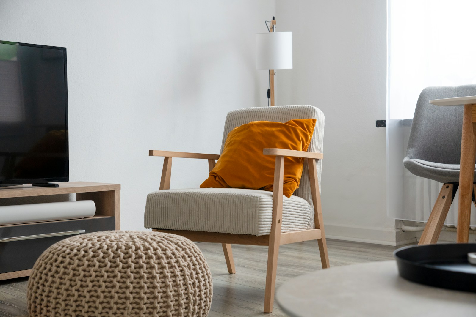
If only one paragraph of this article were to survive, it would be this one. Most failed complementary color combinations are not errors in color choice: they are errors in proportion. Both shades were good, they were simply present in quantities that were too similar, and they canceled each other out by competing for attention.
A supplement is not shared equally: it is measured like a spice, not like a basic ingredient.
The 60/30/10 split, applied to a real room
This is the best-known decorator's rule, and it remains the best safeguard: approximately 60 % for the dominant color, 30 % for a secondary school, 10 % for the accent. In a complementary agreement, the dominant and secondary belong to the same camp — the wall, the large textiles, the carpet — and the complementary plays the role of the 10 %.
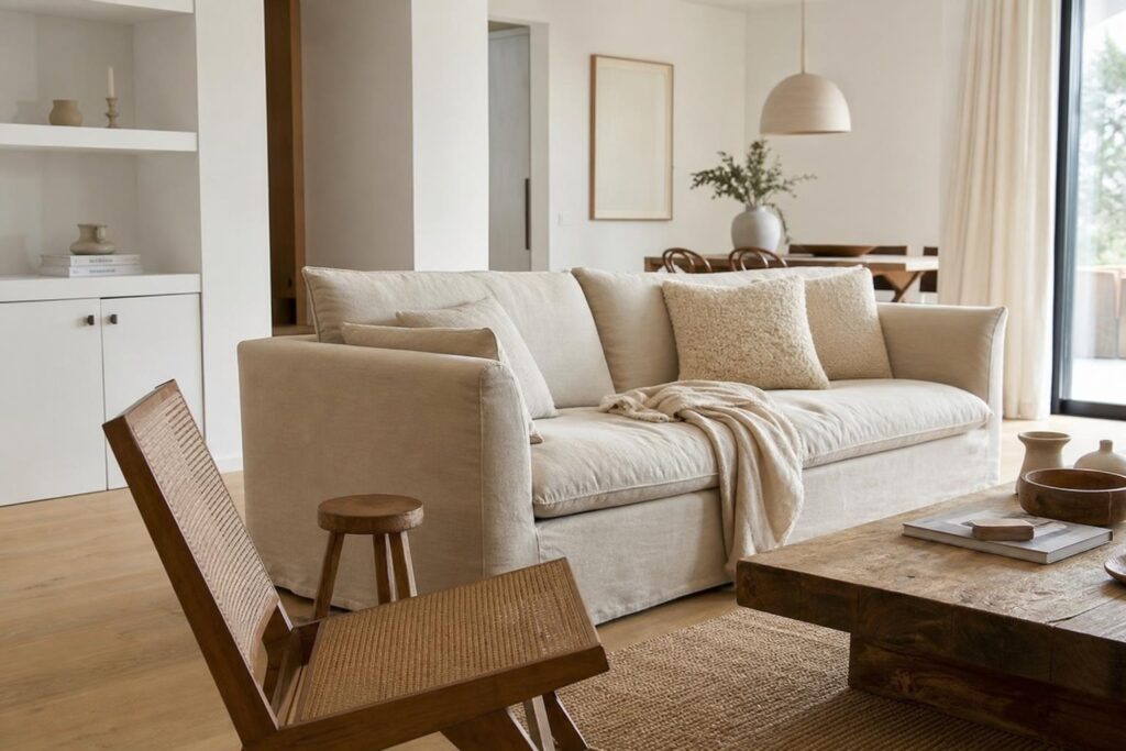
Translated into objects for a living room: gray-blue walls and curtains (60), sofa and rug in ecru and wood tones (30), then cushions, pottery and a terracotta blanket (10). This isn't an accounting down to the square centimeter, it's an order of magnitude — but as soon as the additional area clearly exceeds a quarter of the room, the result becomes erratic.
Blend the two shades rather than contrasting them sharply.
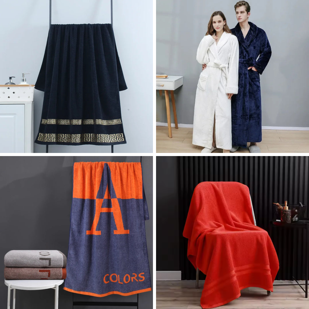
The second lever, just as powerful as the first, is to lower the saturation. A pure complementary color against a pure complementary color creates a jarring contrast. Tone them both down—by adding gray, white, or a touch of the opposite color—and the contrast remains legible but becomes more manageable. This is precisely the subtle difference that distinguishes royal blue from linen blue.
Another useful variation: play on the contrast on the clarity rather than focusing on vibrancy. A very pale ochre on a very dark aubergine works, whereas a medium ochre on a medium purple becomes muddy. When two shades have the same light intensity, the eye no longer knows which one to look at, and the piece appears confused even if the palette is correct.
Where should I place the key so that it is visible?
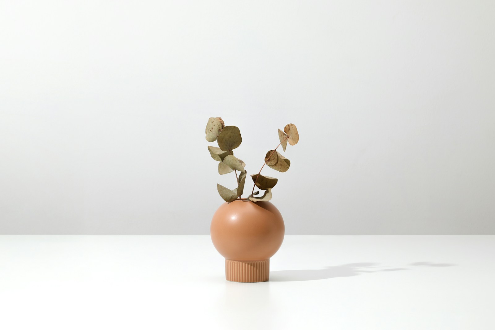
A poorly placed accent piece is a wasted piece. The principle: it should be repeated at least three times in the room, at three different heights, to be interpreted as an intention and not as an overlooked element. Here are the placements that work best:
- At eye level — a frame, a vase on a console, a ceramic piece on the top shelf.
- On textiles — cushions, a throw, a curtain trim: it's the most reversible of all.
- On a single piece of furniture — an armchair, a cupboard door, the inside of a library.
- In small series of objects — Three pots of different sizes are worth ten scattered ones. A selection of well-matched vases often does all the work.
💡 Tip — Before buying the paint, try the square test: paint two A3 sheets of paper with your two chosen colors, place them on the wall in question, and leave them for a whole day. Check them in the morning, at midday, and by lamplight in the evening. Warm artificial light makes yellows and oranges appear more vibrant and dulls blues: a perfect match at 3 p.m. can look off by 9 p.m.
When the supplementary agreement goes wrong
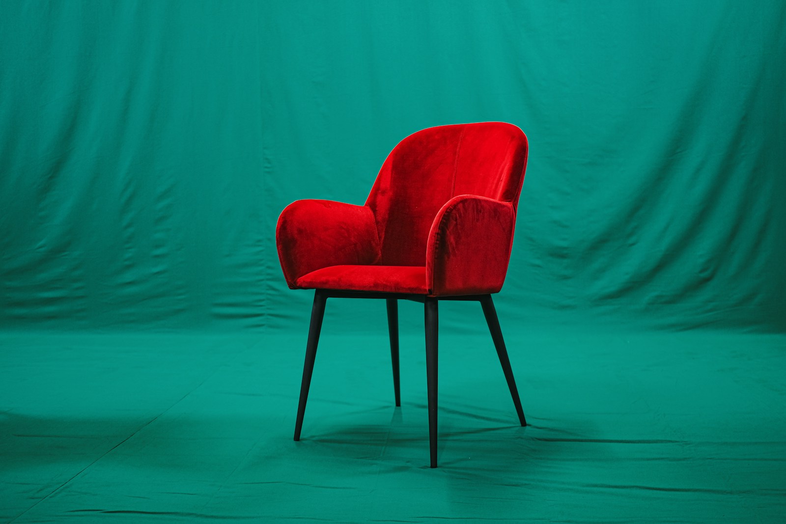
Let's be clear: complementary colors are the riskiest combination in the color wheel. They produce the most memorable and tiring interiors, often using the same colors. Knowing how to recognize the configurations that fail is worth more than ten successful inspirations, because it's always the same two or three that keep recurring.
Two saturated shades in equal parts: mistake number one
This is a textbook example. A bright orange wall facing a bright blue wall, or a red sofa on a green rug of the same intensity. Neither color dominates, so neither rests: the eye moves back and forth without finding an anchor point, and the room becomes exhausting after fifteen minutes — the perceived effect varies from person to person, but the visual imbalance is measurable in a simple photograph.
The solution is simple and costs nothing: choose which of the two prevails. You keep the strong color on the main surfaces and relegate the other to accessories, or vice versa. You don't change the palette, you simply change the balance of power. In a kitchen, where the large surfaces are dictated by the cabinetry, this is even more true—see our guidelines on the color in the kitchen.
The vibration at the edges, and how to turn it off
A second, more subtle pitfall. When two bright complementary colors touch directly, their boundary appears to tremble slightly—an optical effect well known to painters. On a canvas, it's a tool. On a wall or a large piece of fabric, it's frankly unpleasant, especially in a hallway you walk through ten times a day.
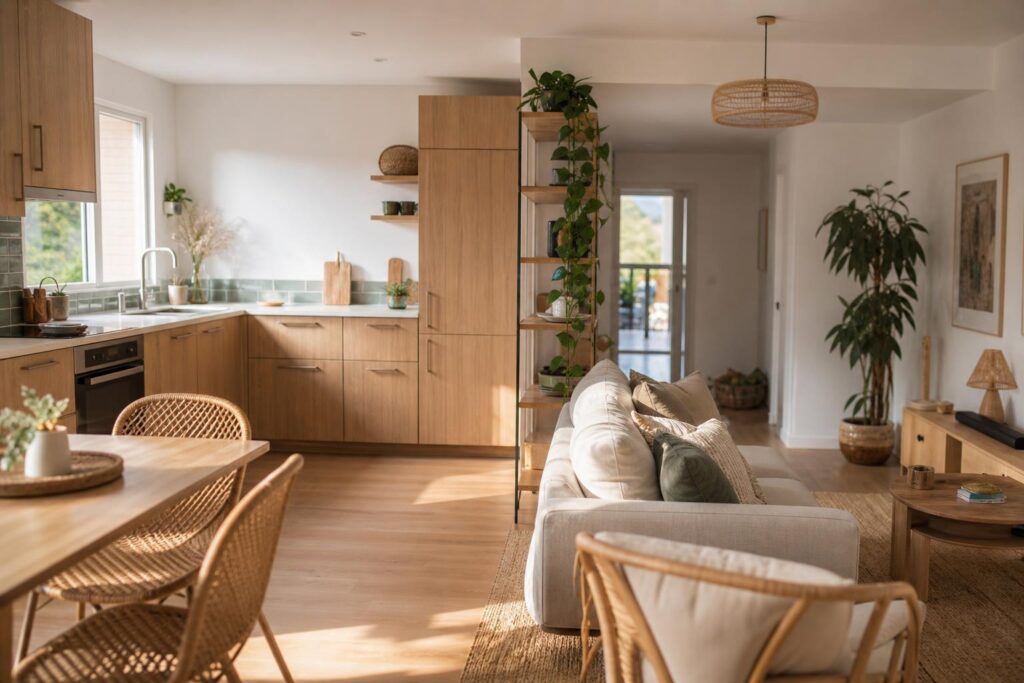
The solution is called a neutral separator Slip an off-white, an ecru, a warm gray, or a light wood between the two. A baseboard, a frame, a strip of wall, or the edge of a shelf will suffice. The two complementary colors continue to interact from a distance, but they no longer clash. Linen, lime, and rattan naturally play this role, which explains their presence in almost all successful contrasting interiors.
Monochrome, analog, triadic: locate the complementary
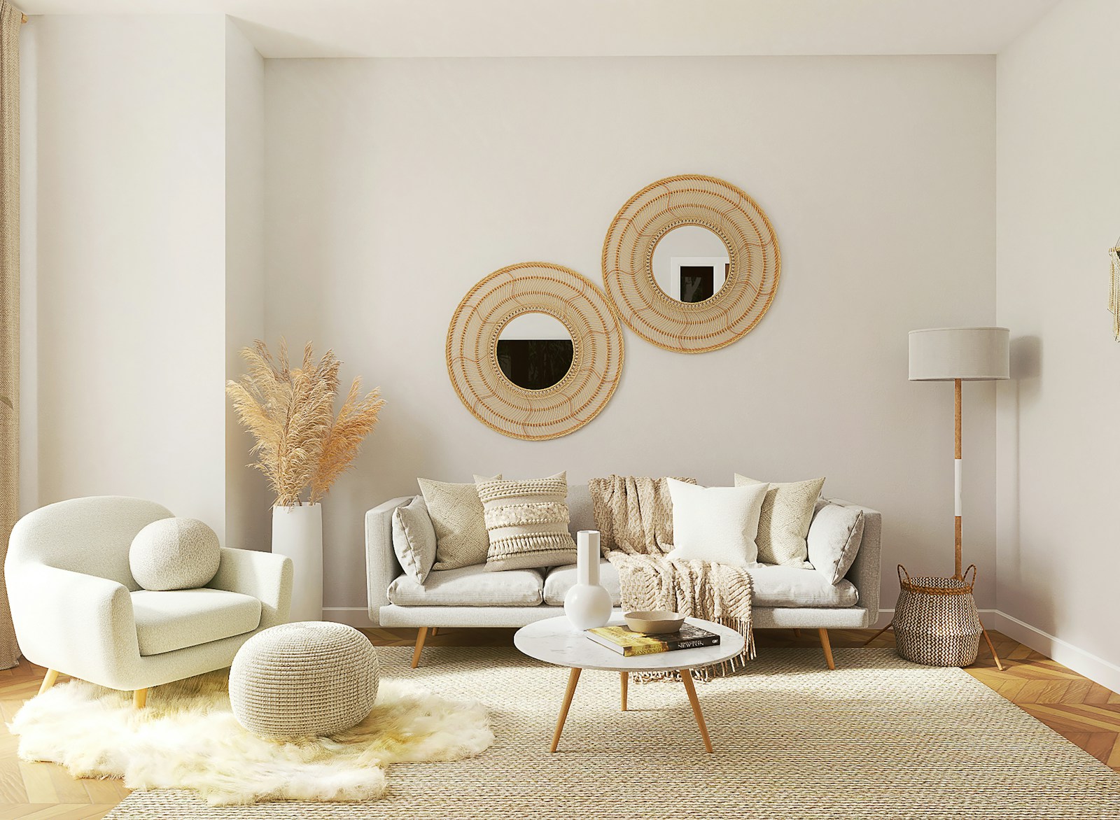
Complementary chords are just one way to interpret the chord progression, and they aren't always the right ones. Understanding the surrounding chords allows for conscious choice rather than simply following a formula. Here are the four other chord types, each described in one sentence:
- Monochrome — a single shade in light and dark variations. The most relaxing, the easiest to mess up through boredom: it is the material (crumpled linen, brushed wood, lime) which must then carry all the relief.
- Similar — two or three similar shades on the color wheel: blue, blue-green, green. A soft and enveloping harmony, without tension. Ideal when the room is already full of furniture or patterns.
- Triadic — three colours at equal distances, like a triangle placed on the wheel. Lively, somewhat graphic; it requires a firm hierarchy, a dominant colour and two accents, otherwise it's chaos.
- Complementary divided — your shade in relation to two neighbors of its supplementary insurance. The contrast of the supplementary insurance, with a third of the risk: this is probably the most underutilized agreement.
How to choose? By considering the room's function rather than the color wheel. A bedroom or office doesn't handle tension well: monochrome or analogous colors work well. An entryway, a hallway, or a dining room are spaces for passage or gathering, where a bold contrast is beneficial—this is where complementary colors truly shine, as our examples demonstrate. color-coded markers for the dining room.
And there's nothing wrong with mixing them: a similar base of blues and greens, enlivened by a single touch of terracotta, remains one of the most enduring palettes you can create. In my opinion, it's even the most reliable formula for a natural interior that never goes out of style.
Want to put theory into practice?
See our color inspirationsFrequently asked questions about complementary colors
What is the color wheel?
The color wheel is a wheel that arranges colors in the order of the spectrum: the three primary colors (red, yellow, blue in painting), the secondary colors created by mixing them, and then the tertiary colors. Two hues placed opposite each other on the wheel are complementary. It is the basic tool for creating a palette.
Do complementary colors go well together?
Yes, provided they are used in moderation. Two complementary colors enhance each other, but in equal proportions and at full saturation, they clash. The formula that works: a broad, soft dominant color, with the complementary color used sparingly on a small portion of the surface.
Why do we talk about complementary colors?
Because they complement each other: when mixed as pigment, two complementary colors cancel each other out and produce a brownish gray; side by side, each makes the other more intense. The correct spelling is "complementary colors," plural of both words, and not "colors" or "complementary."
What is the complementary color to green?
On the painter's circle, the complementary color to green is red. In decoration, muted versions of this pair are almost always preferred: a sage or olive green with a touch of terracotta, rust or brick, rather than bright green and pure red.
Are complementary colors the same in painting and on a screen?
No. The painter's circle starts with red, yellow, and blue: the complementary color of blue is orange. A screen works with light, using red, green, and blue: the complementary color of blue then becomes yellow. For decorating, remember the painter's circle.
What is the difference between complementary colors and adjacent colors?
Complementary colors face each other on the color wheel: maximum contrast, dynamic effect. Adjacent, or analogous, colors are close together—blue, blue-green, green—and create a soft, almost monochromatic harmony. The former are chosen to enliven a room, the latter to calm it.