Our article in brief
- A kitchen color is not chosen from an inspiration board but in the room : exposure, volume, and above all what is already there and will not change.
- First filter, the’exposure : in the north, shades loaded with yellow or red; due south, colored greys, deep greens and blues hold.
- Second decision, the distribution : walls, lower facades, upper facades, backsplash. The same color does not tell the same story depending on the surface it occupies.
- Repainting the facades transforms the kitchen more than a wall — but it is the support, not the shade, that determines the result.
- The specific cases resolved at the end of the article: cooking YELLOW, kitchen black or white, wooden kitchen, two-tone kitchen.
There comes a point in every kitchen project where the question boils down to one sentence: which one do I choose? You probably already have a dozen images in mind, a desire for deep green or terracotta, and that unpleasant feeling that there's no guarantee the color will hold up in your home.
It won't necessarily last, and it's not a matter of taste. A color doesn't exist in the absolute: it exists within a room, with its orientation, a window, a countertop that won't be replaced, and a floor that won't be redone. The same deep green can be sumptuous in a south-facing kitchen and frankly gloomy in a seven-square-meter space exposed to the north.
This guide won't tell you the color of the year: we discuss that elsewhere, in our kitchen color trends 2026 and in the five colors of 2025, And that's another topic—inspiration. Here, we're looking for a decision method What to look at before choosing, a light filter, a distribution rule, and then straightforward answers to the questions everyone is asking. In the end, you should be able to discard three-quarters of your images and keep the good ones.
What color for a kitchen? Start with what won't change.
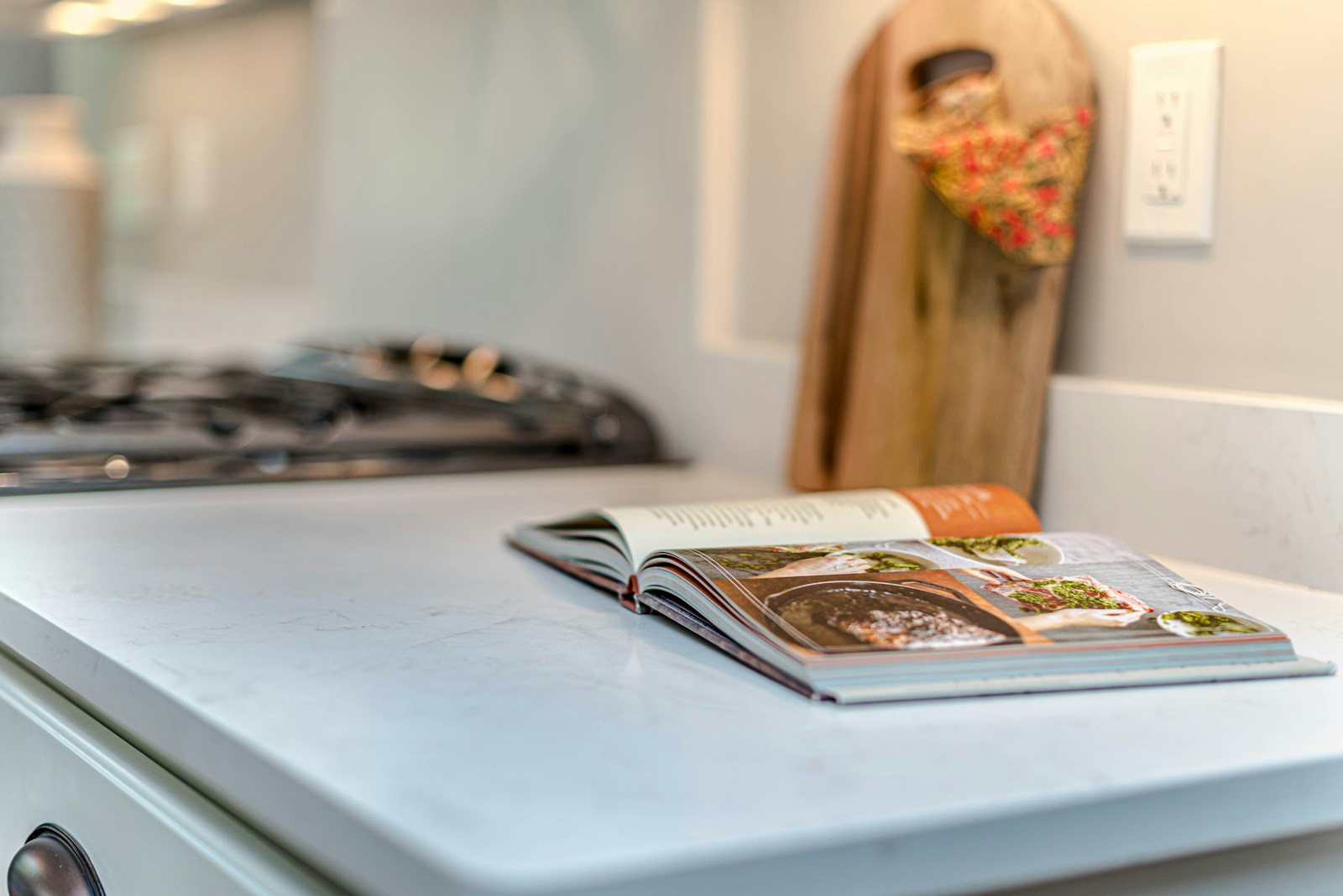
Most poor color choices stem from the same problem: the shade is chosen first, and the expectation is that everything else will follow. But in a kitchen, everything else matters. You don't change a countertop just because the blue you like doesn't match. The honest approach, therefore, is to do the opposite: first identify what's fixed, and then choose only from what's still possible.
Take stock of what already exists
Take the room as it is and lay out the elements that will remain after your work. These will dictate the family of colors, because they already occupy surface area and each has a temperature — a warm or cool nuance that is barely noticeable until it is contradicted.
- The work plan A wood-effect laminate, grey quartz, and speckled black granite don't open the same doors. It's the largest visible horizontal surface, and it weighs a lot.
- The credenza : subway tiles, zellige, stainless steel, glass. An enameled zellige reflects light and vibrates — it doesn't like competition.
- The ground Terracotta, cement tiles, parquet flooring, polished concrete. A floor full of patterns practically precludes colored walls.
- Visible household appliances : stainless steel tends towards cold, matte black absorbs, an old built-in oven often imposes its own shade.
- The joinery : the white of a PVC window is almost always a cold white, and this is noticeable as soon as you paint around it in warm white.
Next, consider which material is the most expressive. If your backsplash is highly graphic or your countertop heavily veined, the wall color should play a supporting role, not take center stage. Conversely, if everything is neutral and muted, you have room for a bold color. We've compiled some concrete examples in our backsplash ideas for a black and white kitchen, useful precisely for arbitrating who gets to speak.
What area will the color actually cover?
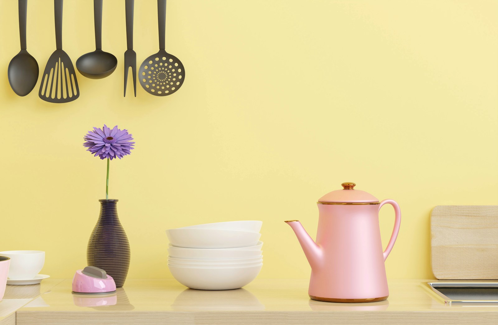
This is the question we often forget, and it changes everything. The same shade doesn't have the same intensity on two square meters of bare wall, across all the lower walls, or throughout the entire room from floor to ceiling. A forest green applied to a section of wall between two windows is an accent; the same green on twelve square meters of wall creates an atmosphere, much more inviting to live in.
So do the math before you choose. In a standard fitted kitchen, the wall cabinets, backsplash, and appliances take up a large portion of the walls, often leaving only narrow strips. A subtle color disappears completely, and the effort put into painting goes unnoticed. It's precisely in this situation that repainting the facades rather than walls gives a result in a completely different order, and we will come back to that later.
Exposure and light: the filter that eliminates the most errors
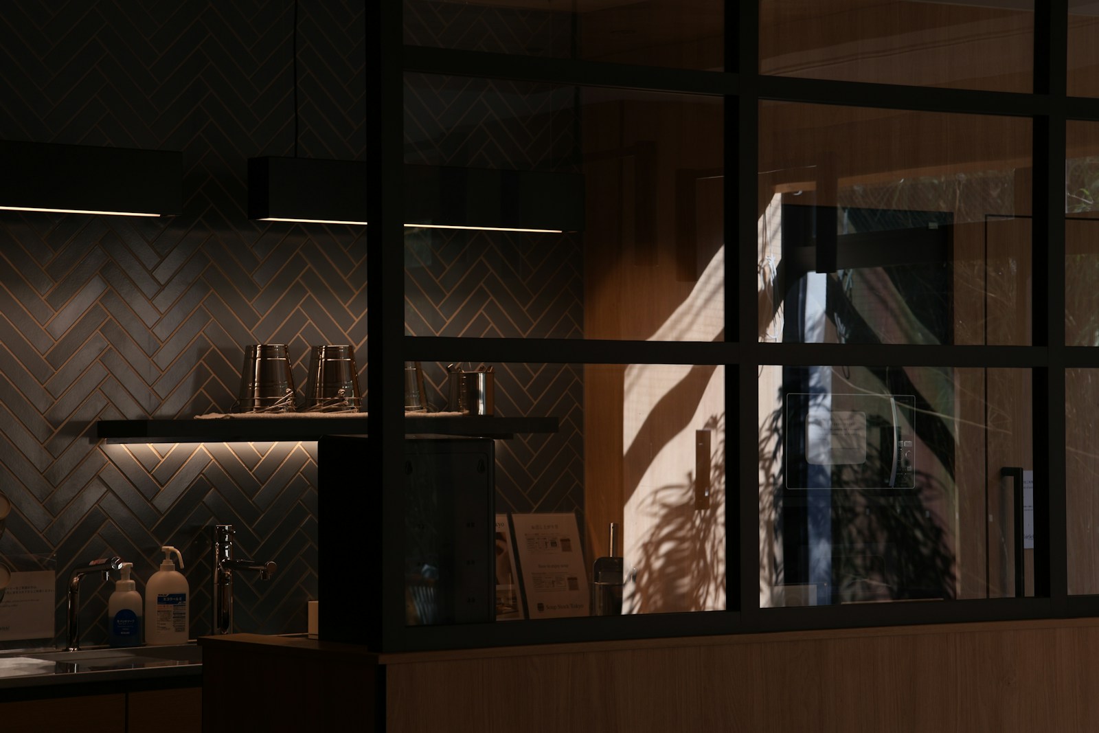
If I had to choose just one criterion, it would be this. Natural light doesn't illuminate a color; it creates it. A hue is the result of how the surface reflects the light it receives: change the light, and you change the color. This is why a sample seen in a store and the same sample in your home don't look alike, and that's not an illusion.
A northern cuisine: warming up without weighing it down
A north-facing room never receives direct sunlight. Its light is steady, soft, and distinctly bluish. It has a formidable effect: it drains cool tones. A pearl gray chosen for its delicacy becomes dull, a light blue takes on a hospital gown hue, and a pure white appears dirty gray from morning till night.
The answer is not to go towards clarity at all costs, it is to go towards the hot Shades containing yellow, red, or brown. Creamy off-whites, rosy beiges, muted yellows, light terracotta, and greens rich in ochre, reminiscent of olive and sage. These color families absorb the coolness of northern light instead of being overwhelmed by it. And contrary to popular belief, a northern kitchen can handle a medium to dark shade very well if it's warm: a bold, deep brown is far better than a dull, pale gray.
A south-facing kitchen: tempering rather than illuminating
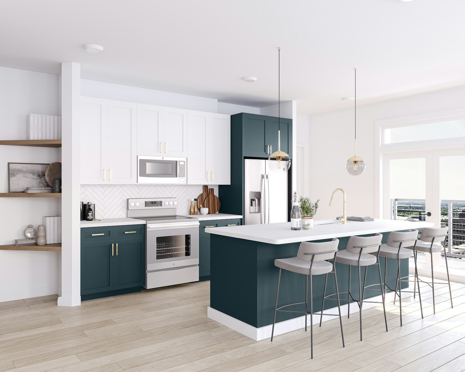
The opposite problem arises when facing south, and it is less frequently addressed: abundant light oversaturates whatever it touches. A yellow chosen for its cheerfulness becomes garish in the hottest hours, an orange saturates, and a brilliant white on large surfaces ends up dazzling and tiring, especially in a room where one works standing up.
This is where the colors we hesitate to use finally work: tinted grays, deep greens, true blues, warm browns—all those tones that a dark room would stifle. The sun gives them depth instead of washing them out. To the east and west, the light changes dramatically throughout the day—golden in the morning, low in the evening—and it's better to aim for mid-range tones like stone, sand, and sage, which remain flattering from morning to night, rather than a saturated color that will only look good at a specific time of day.
And a dark kitchen or one without windows?
In a windowless kitchen, a cooking corridor, or a back kitchen, there is no longer any natural light to complement: there is only artificial light to reflect. The rule changes. We look for reflective surfaces—warm white, cream, very light beige—and a satin finish Rather than matte, because satin reflects some of the light instead of absorbing it. The choice of deep colors in a windowless room can be magnificent, but it's a bold statement, not a solution for comfort: something to embrace, not something to endure.
In video: "What is the ideal color for a kitchen?" (BricolMaison) — a useful reminder of the role of light before that of the color chart.
Small, large, open or closed: matching color to volume
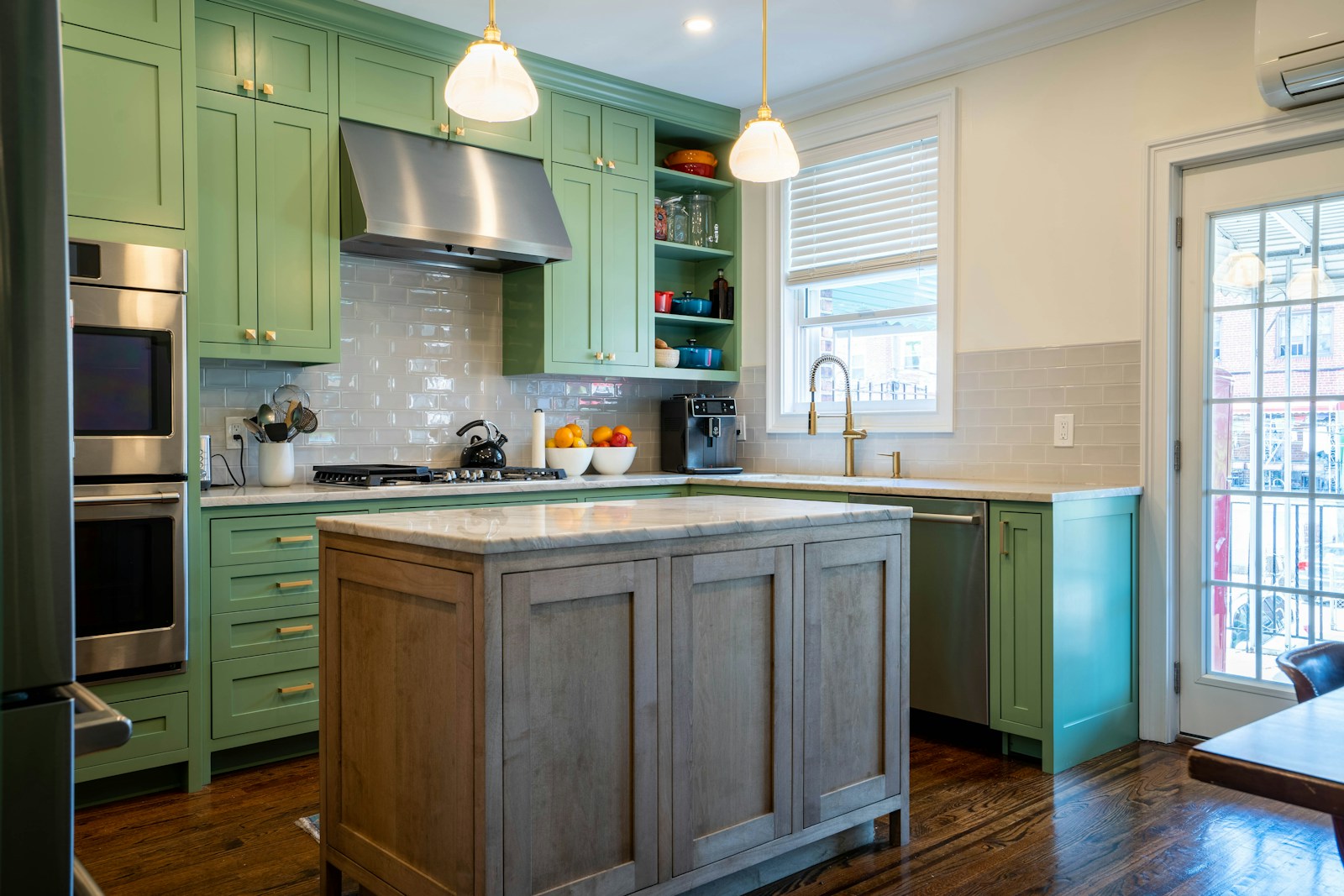
After light comes geometry. A closed six-square-meter kitchen and a kitchen open to a forty-square-meter living room do not pose the same problem: the first requires not to divide, the second to enter into dialogue with a neighboring room which already has its colors.
Small, enclosed kitchen: one shade, multiple intensities
What makes a small kitchen feel smaller isn't dark colors; it's the abrupt changes. Every stark contrast breaks the space into pieces, and the eye adds up the pieces instead of perceiving a unified whole. In a small, enclosed space, I strongly advise sticking to a single color family and playing with intensity: walls in the lightest shade, upper cabinets in the same tone, and lower cabinets a shade or two darker. This maintains depth without creating barriers.
The second lever is height. Painting the walls all the way to the ceiling, including the ceiling, in a light color eliminates the break line and visually lengthens the room. Conversely, a frieze or wainscoting at mid-height makes the space feel cramped. If you dream of a bold pattern, the perfect spot is a wall away from the cooking area: a original wallpaper behind a table or on the entrance wall does exactly the desired decorative job, where it will not be exposed to grease or steam.
Open kitchen: how to ensure continuity with the living room?
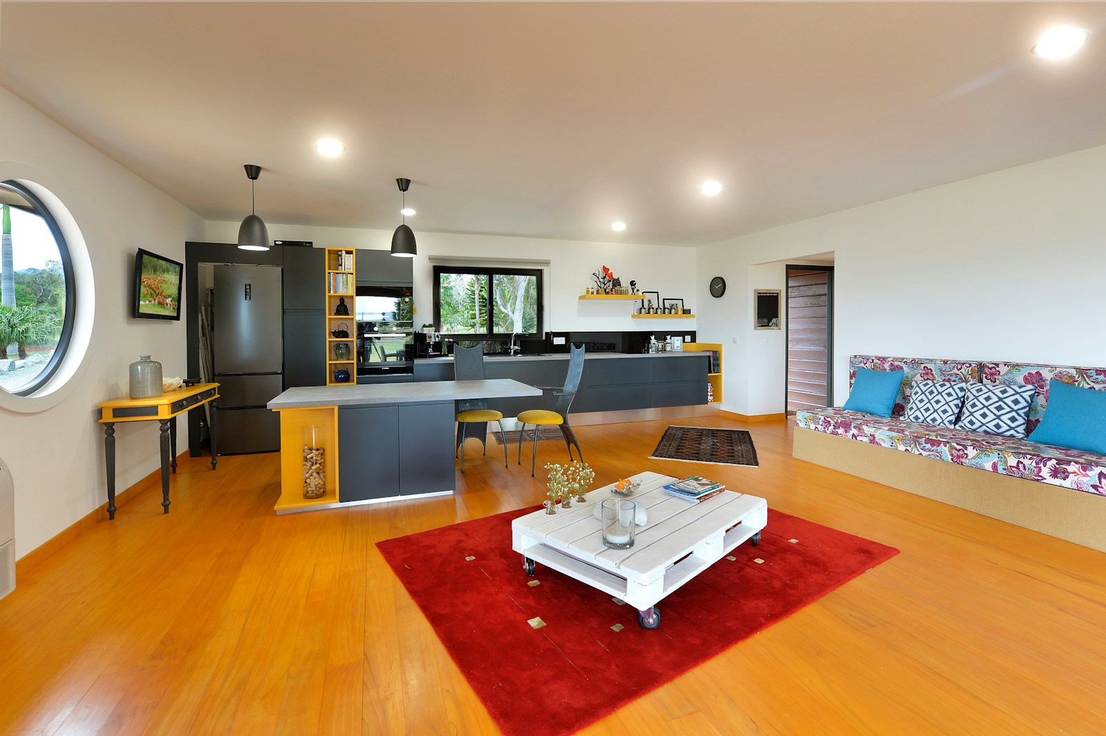
In an open-plan kitchen, color is no longer chosen for the kitchen itself; it's chosen for the entire space. Readers who treat their kitchen as a separate room will find themselves with two distinct areas facing each other across an island. The rule I apply is simple: the kitchen should echo a color already present in the living room, but in a more muted or lighter shade, never a completely new color.
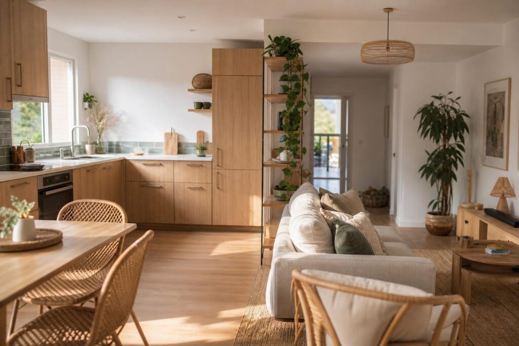
Wood is the obvious ally in this continuity, because it is perceived as a material and not as a color: a common wood species for the table and the facades connects the two areas without homogenizing them. The same reasoning applies to the dining area, where the colors must complement each other—this is the subject of our color schemes for the dining room, to be read in parallel if your kitchen opens onto the table.
| Location of your kitchen | Families of colors that work | Avoid | For what |
|---|---|---|---|
| North-facing, without direct sunlight | Creamy off-white, rosy beige, muted yellow, light terracotta, olive green | Cool greys, icy blues, pure white | Northern light has a bluish tint: it washes out cool tones and makes them appear grey. |
| Facing south, very bright | Colorful greys, deep greens, bright blues, warm browns | Bright yellows, saturated oranges, large expanses of brilliant white | Direct sunlight oversaturates warm hues and transforms white into dazzling glare. |
| East or west facing | Stone, sand, sage tones, mid-range shades | Highly saturated colors | The light varies greatly from morning to evening: a medium shade remains accurate throughout the day |
| Small and closed | A single family, walls and upper parts in light colors, lower parts more subdued. | Two contrasting shades, mid-height base | It is the breaks that shrink a small volume, not the intensity of the color. |
| Open to the living room | A color from the living room repeated in a lighter or more muted shade, wood as a unifying element | A standalone color, without echo in the neighboring room | The kitchen reads like part of the living room, not like a separate room. |
| Dark, one-eyed, or back kitchen | Warm white, cream, very light beige, satin finish | Dark shades in a deep matte finish, if comfort is what you're after. | Without natural light, the role of color is to reflect artificial light. |
| Worktop or floor already very prominent | Muted and discreet shades, tone on tone | A second strong color, an additional pattern | Two elements that speak loudly cancel each other out instead of enhancing each other. |
Kitchen cabinet color: the decision that changes everything
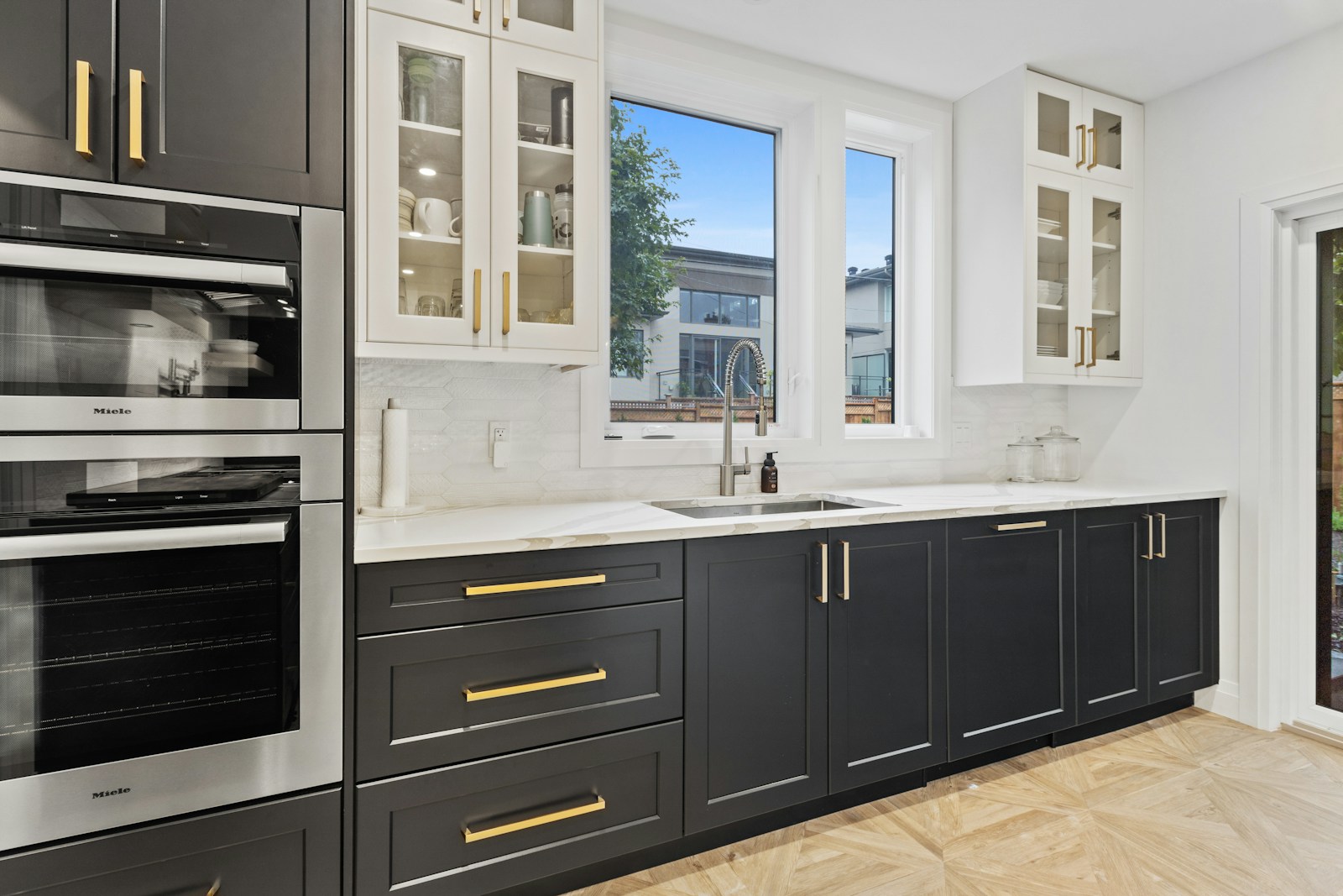
Repainting the walls of a fitted kitchen is often disappointing, for the reason mentioned above: there are hardly any walls. Repainting the facades, On the other hand, it changes the room from floor to ceiling, because the furniture is the dominant vertical surface. It's the most transformative gesture in a kitchen, and it's also the one that requires the most serious planning.
Dark lows, light highs: the forgiving color distribution
Before choosing the color of the furniture, decide on the distribution. A hierarchy works almost everywhere: dark at the bottom, light at the top. It mimics what the eye expects from a landscape—a mass on the ground, light above—and it has a decisive practical advantage, since marks and dents are much less visible on dark lower furniture, precisely where they occur.
- Low furniture : the color of character. Deep green, slate blue, sienna, warm brown, black in a very bright room.
- Tall furniture : light, or nothing at all — removing them in favor of shelves lightens the space more than any color.
- Walls : the bonding color, chosen in the same temperature as the facades.
- Credenza It either disappears into the color of the walls, or it becomes the sole star. Never anything in between.
Two-tone kitchen: where to place the break
A successful two-tone kitchen isn't defined by its two colors alone, but by the clarity of its separation. A distinct horizontal line—the countertop—or a separation by volume—an island in one shade, the cabinets in another—is clearly intentional. Conversely, two colors distributed haphazardly, a cabinet here, a tall unit there, appears haphazard. If you're unsure, stick with two shades from the same family and differentiate them through intensity: this is my favorite combination, by far, because it never goes out of style.
Repainting facades: what color cannot fix

On cabinet fronts, the result comes from the substrate and the finish, not the color. Melamine or laminate doesn't receive any paint directly: it requires thorough degreasing, sanding, and then a suitable primer; otherwise, even the most beautiful color will flake off at the handles within a few months. Raw wood absorbs paint, so an additional coat is necessary. As for the finish, satin is a sensible compromise in a kitchen: it's washable, which a deep matte finish doesn't hold up well near the cooktop.
One final point to consider at the time of purchase, and one that is far from decorative: paints sold in France carry a label indicating their emissions of volatile pollutants, graded from A+ for the lowest to C for the highest, as explained by the Ministry of Ecological Transition. In a room where meals are prepared, aiming for the top of the ladder is a simple reflex, and it's best to ventilate thoroughly during and after the work — a subject that...’Anses documents for the entire indoor air.
💡 Tip — Never buy a color based on a swatch. Paint two coats on a large sheet of heavy paper, tape it to the wall in question, and look at it three times: in the morning, in the late afternoon, and in the evening under your lamps. It's the most cost-effective test of the entire project, and the one that most often leads people to abandon their initial choice.
Yellow, black, or white kitchens, wood: the cases you're looking for
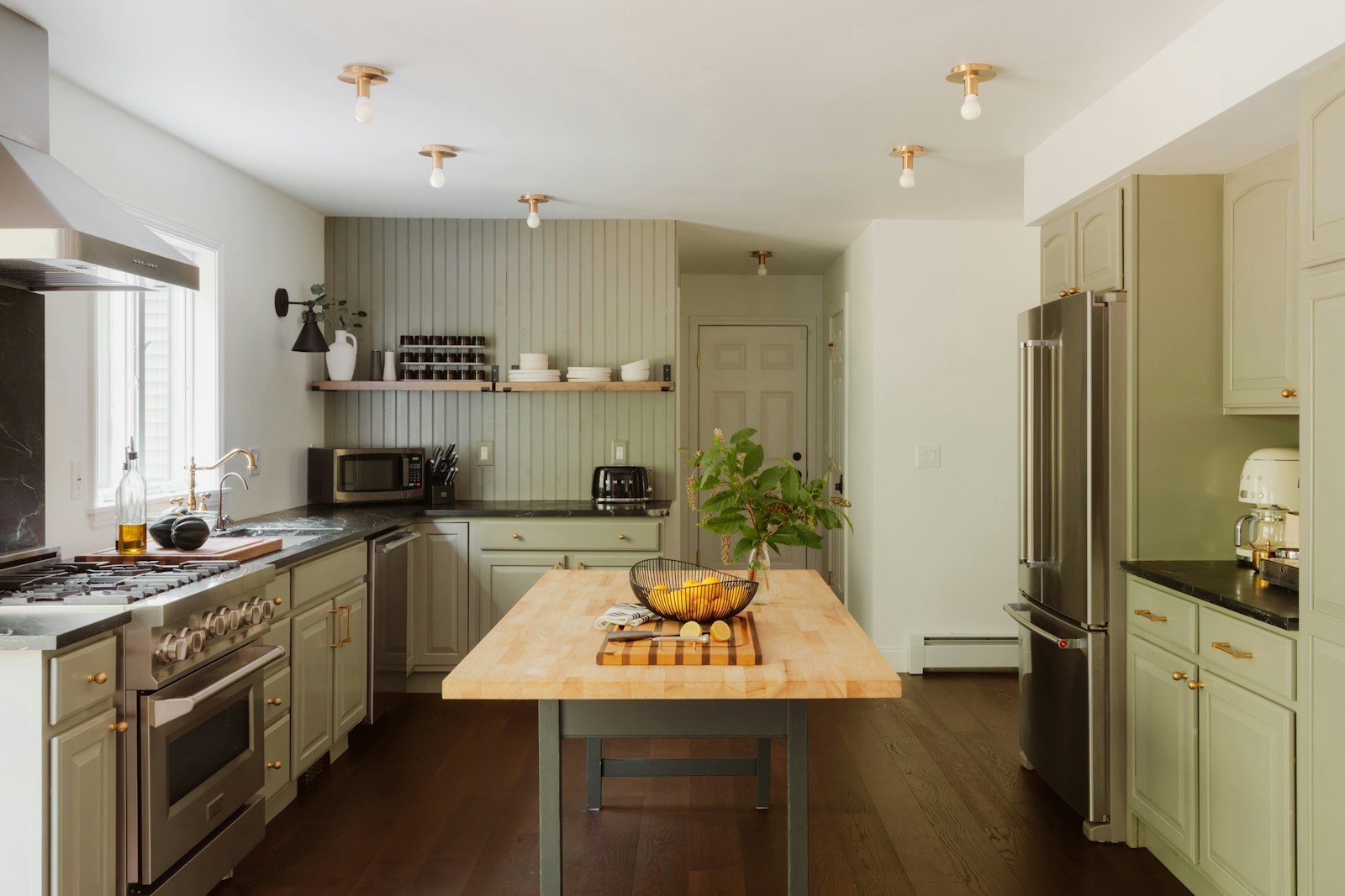
What remains are the questions posed as such, the ones we type in at night hoping for a definitive opinion rather than a list of options. Here are mine, along with their conditions.
Yellow kitchen: under what conditions does it work?
Yellow is the most unfairly maligned color in cooking: adored in images, dreaded in practice, because we always imagine it in its brightest form. But that's precisely where it falls short. Saturated yellow on large surfaces becomes tiring, and it turns green as soon as cool lighting is introduced. The yellows that work are muted yellows, infused with gray or ochre: mustard, straw, honey, wheat. They retain warmth without the jarring effect.
Its ideal setting is a north-facing or dimly lit kitchen, precisely because it brings the warmth that's often lacking. A straw yellow on the lower cabinets, off-white walls, light wood: the combination is soft and timeless. On the other hand, reserve it for a small space, a doorway, or the inside of a shelf, even if it faces south.
Black or white cuisine: do we really have to choose?
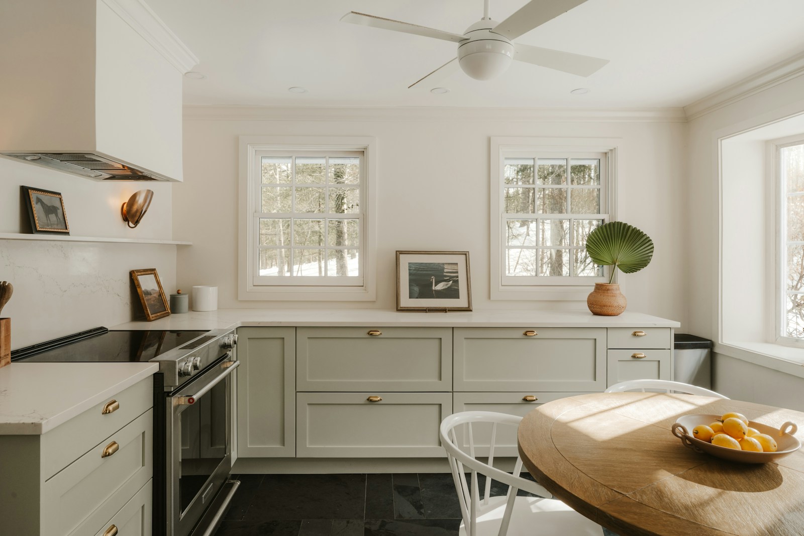
This is the most frequently requested decision, so let's be clear. White is the safe choice: it suits all sizes, it's timeless, and it allows materials to shine—but pure white in a north-facing room is a mistake; you need a warm white, off-white with cream or pink undertones. Black is the bold choice: it lends immediate elegance and flatters both brass and wood, but it requires natural light, proper countertop lighting, and it shows every fingerprint on a matte finish.
If you ask me to make a final decision: don't choose, distribute. Black on the lower cabinets and woodwork, warm white on the upper cabinets and walls. You get the character of black and the volume of white, and you avoid two pitfalls—the all-white kitchen that lacks structure, the all-black kitchen that becomes a cave by November.
A color is not chosen from a color chart, but in the room, at the time of day when one lives there.
A wooden kitchen: what colors go with it?
Wood isn't neutral; it's a color with a temperature, and everything depends on which one. Light oak or ash tends toward honey: they harmonize with muted greens, sage, blue-gray, and off-white. Walnut or a dark-stained wood leans toward red: it calls for earthy tones, ochre, terracotta, and deep green. The classic mistake is to place a cool gray on an orangey wood, a combination that always clashes a little.
A solid wood kitchen doesn't need a strong color: the walls act as a backdrop, in a shade close to the wood but lighter. And if you're looking to create a cohesive color palette for the whole house, our color and style guidelines provide the general framework within which your kitchen will fit.
Your method is ready — now you just need to find the shade that speaks to you.
See our kitchen palettes in picturesYour frequently asked questions about kitchen color
What is the best color to make a kitchen look bigger?
No single color makes a room appear larger: it's the absence of breaks in continuity that creates volume. A light, warm shade, applied to the walls, upper furniture, and ceiling in the same tone, eliminates visual breaks and makes the room appear larger than a contrasting white.
What color goes well with white kitchen furniture?
White furniture goes with almost anything, so start with your countertop. With a wood or beige countertop, go for sage green, terracotta, or blue-grey. With a grey or black countertop, opt for a deep blue, forest green, or a colored grey on the walls.
What colors should be avoided in a kitchen?
Avoid cool grays and blues in a north-facing room, saturated yellows and oranges in a south-facing room, and large expanses of pure white that are blinding. Also avoid deep matte finishes near cooktops: they are difficult to clean and show marks easily.
How to match the colours of an open-plan kitchen/living room?
Don't choose a completely new color for the kitchen. Use a shade already present in the living room, in a lighter or more muted version, and circulate a common material, most often the same type of wood, on the table and on the fronts.
What color would suit a kitchen in the north?
Warm hues containing yellow, red, or brown: creamy off-white, rosy beige, straw yellow, light terracotta, olive green. Northern light, being bluish, dulls cool tones. A warm, medium-intensity color is more suitable than a pale gray.
What color would suit a grey kitchen?
Since gray lacks warmth, pair it with a color that adds it. Light wood, terracotta, mustard, and ochre warm up gray furniture. To keep things understated, off-white walls and a sage green accent are enough to prevent the overall look from feeling cold.